YMCA Illustration system
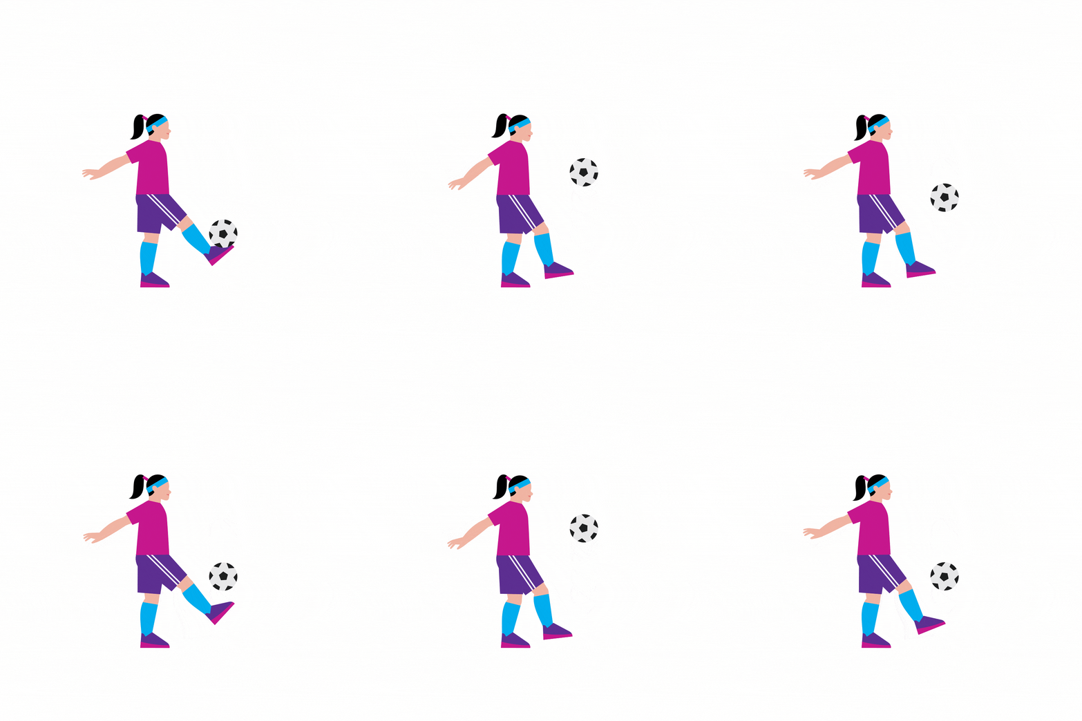
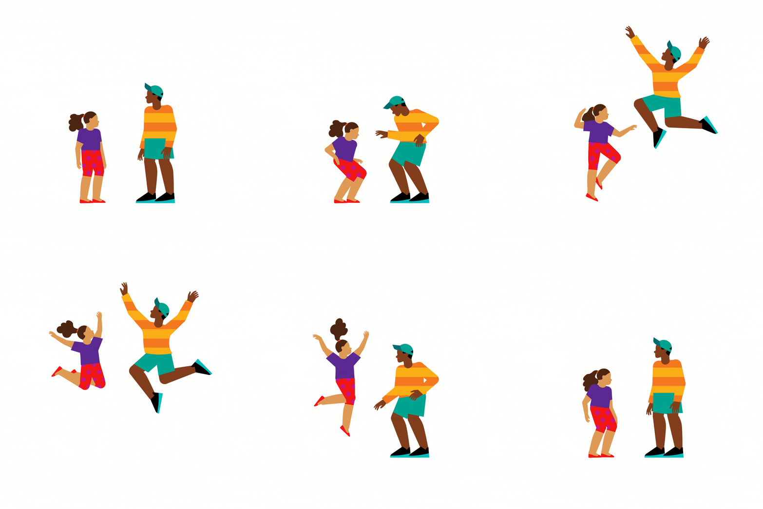
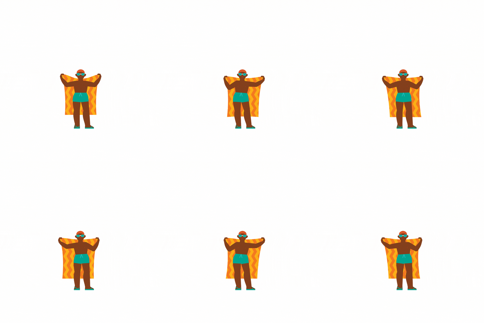
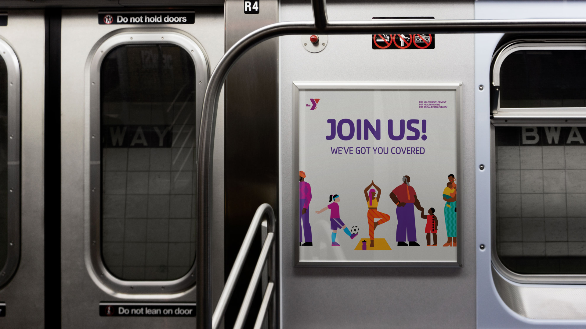
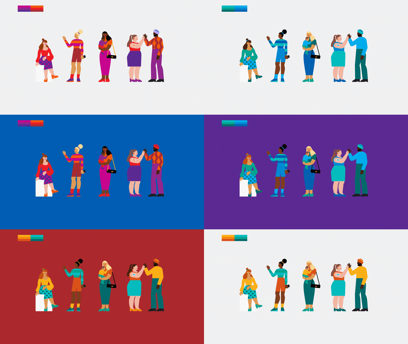
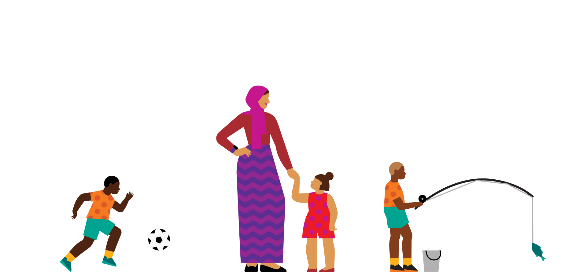
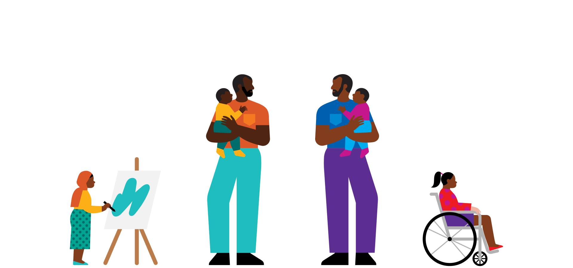
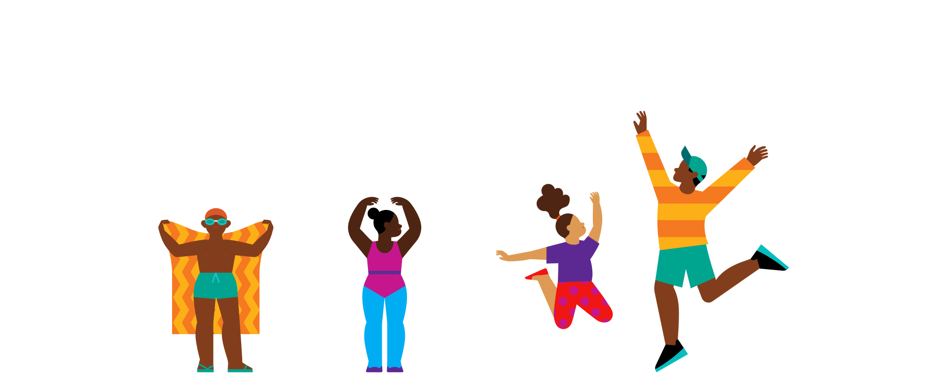
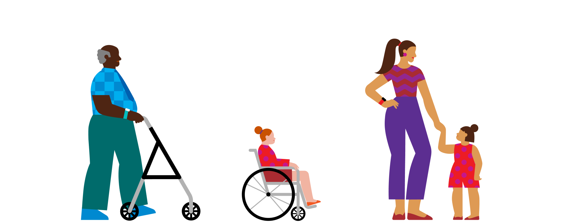
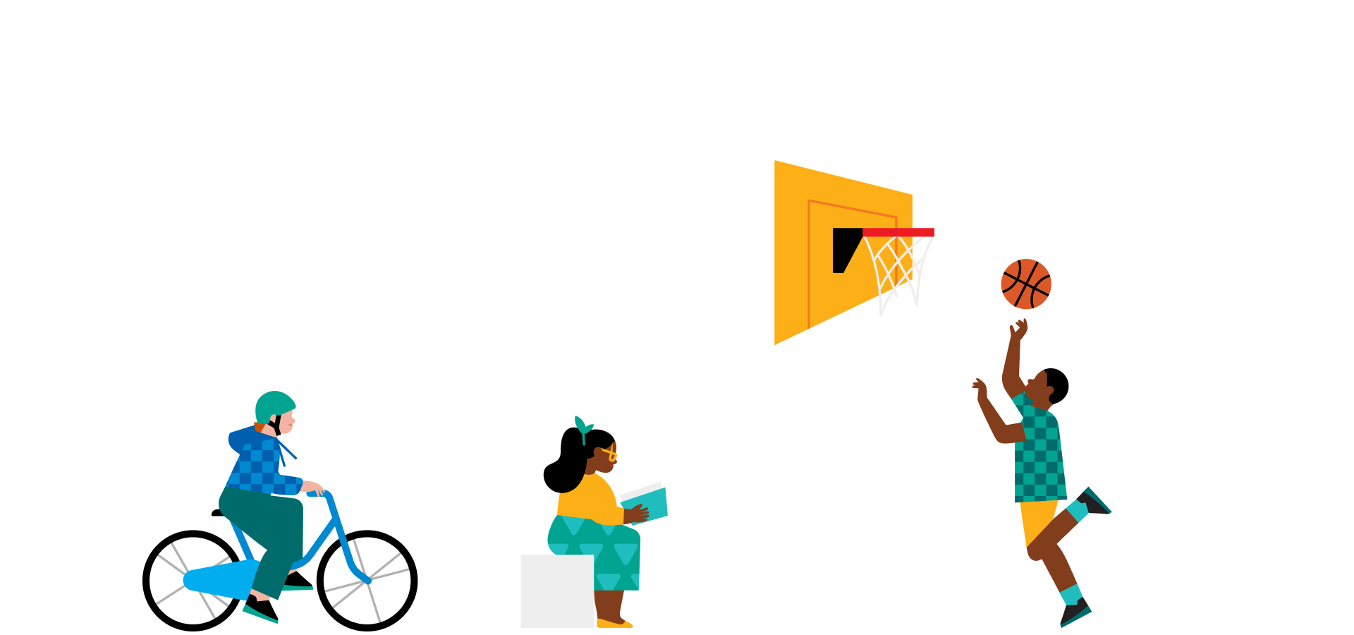
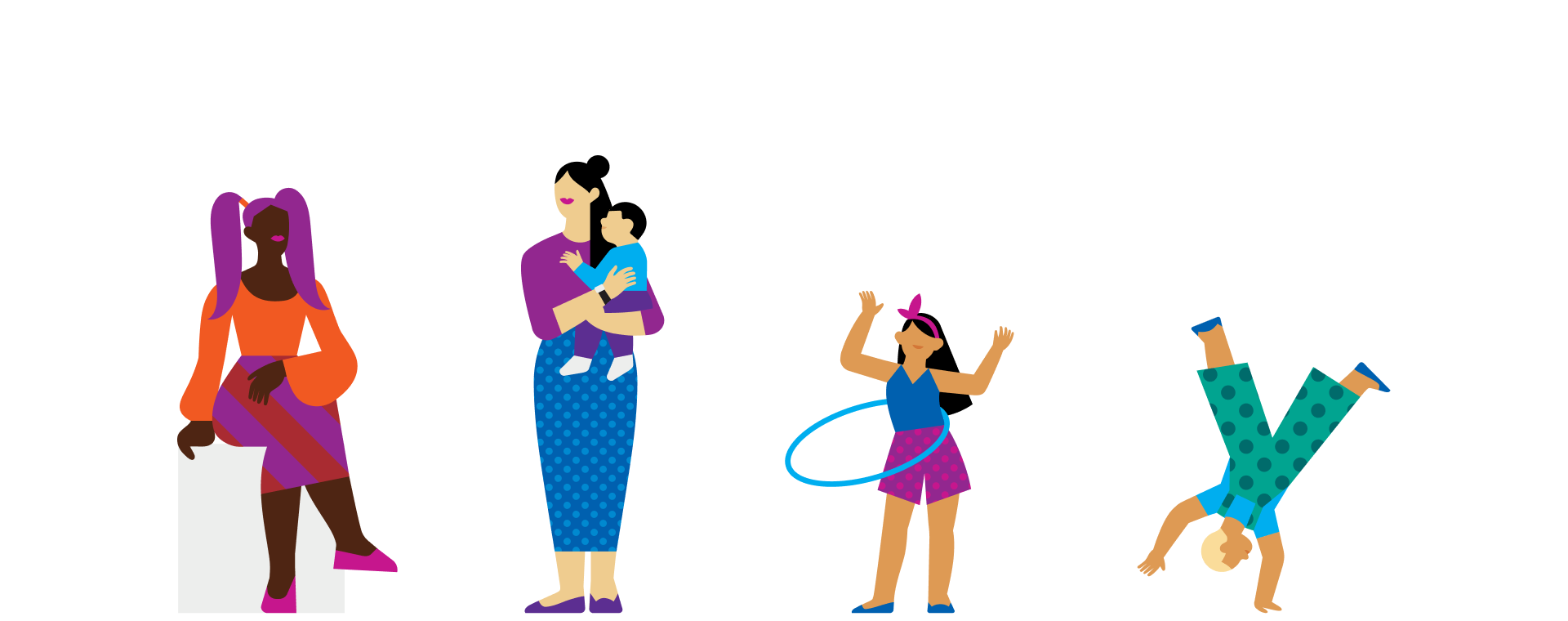
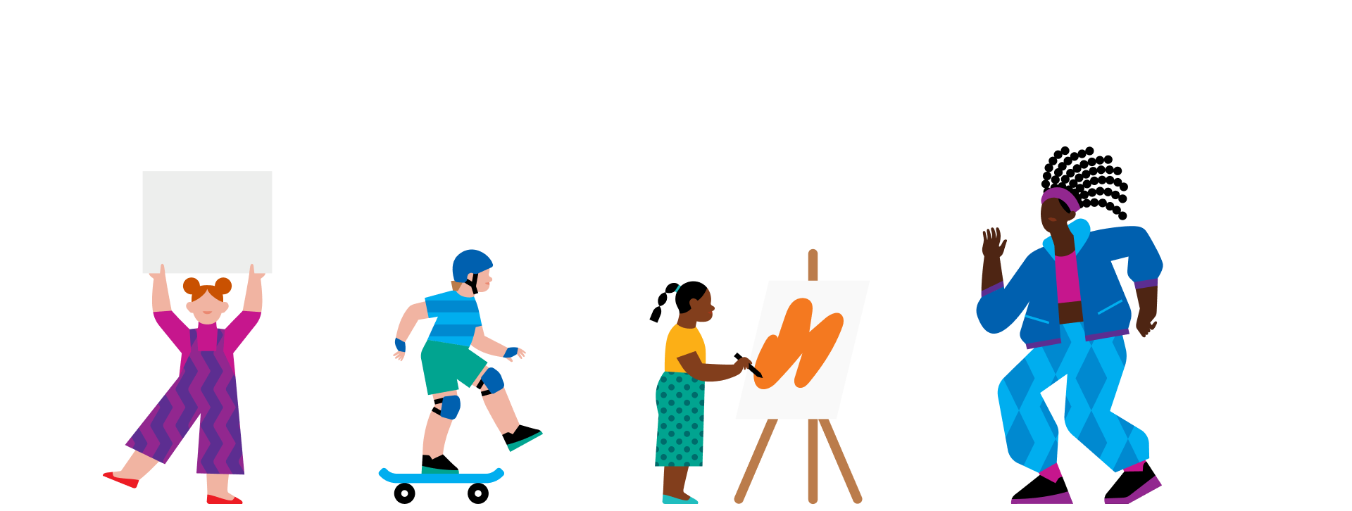
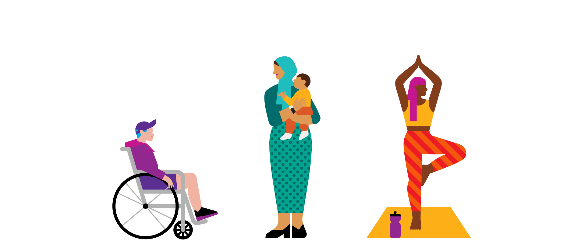
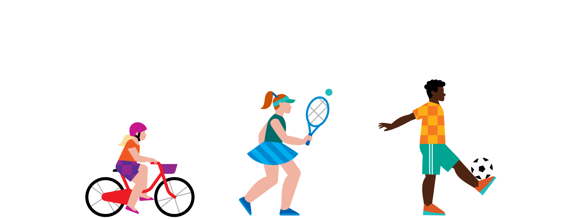
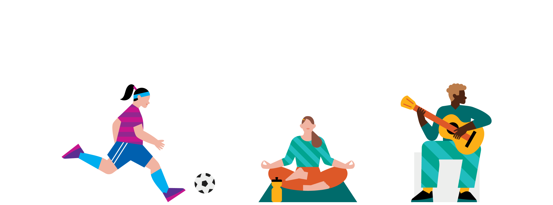
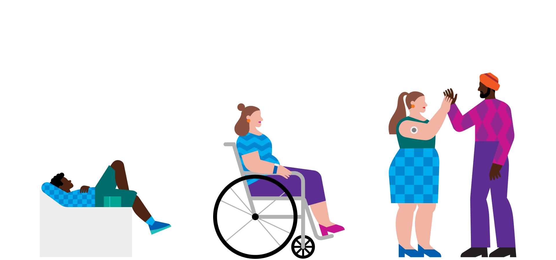
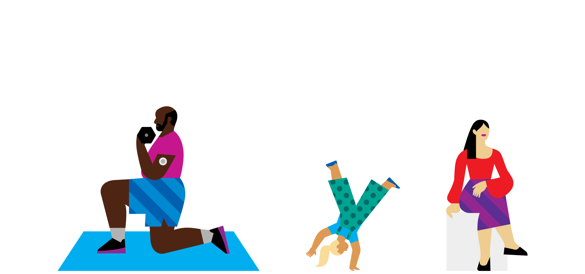
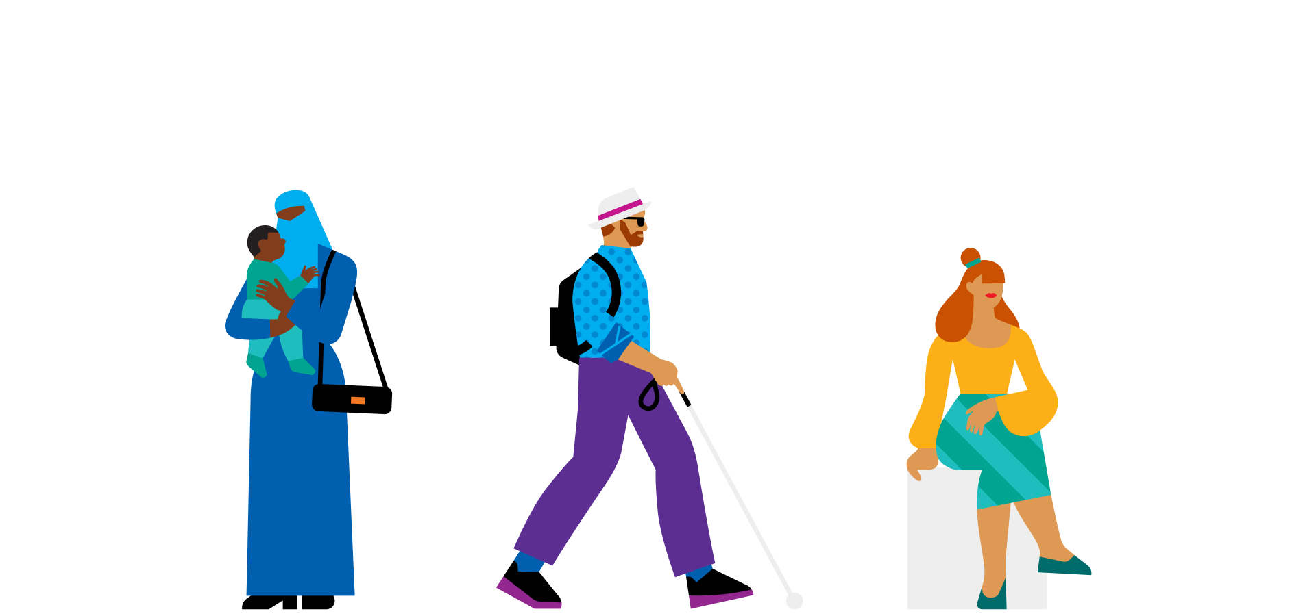
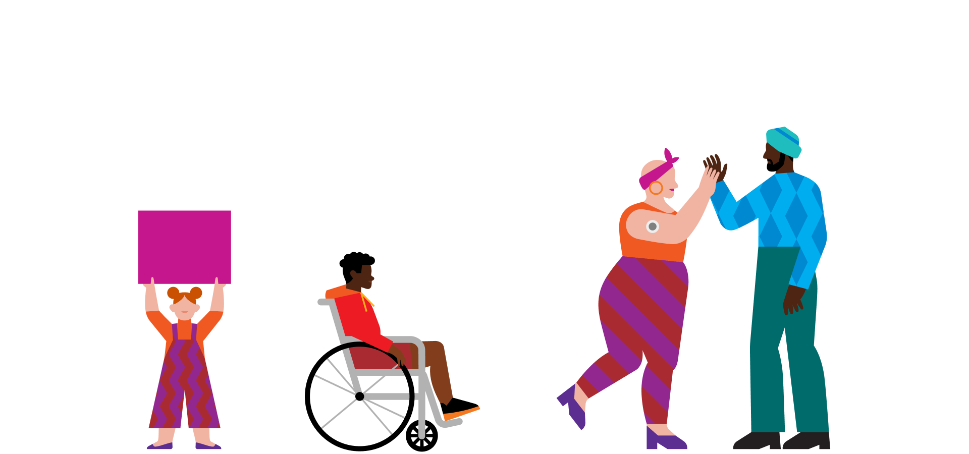
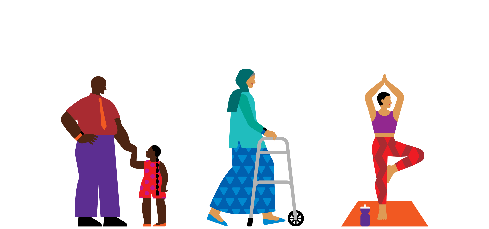
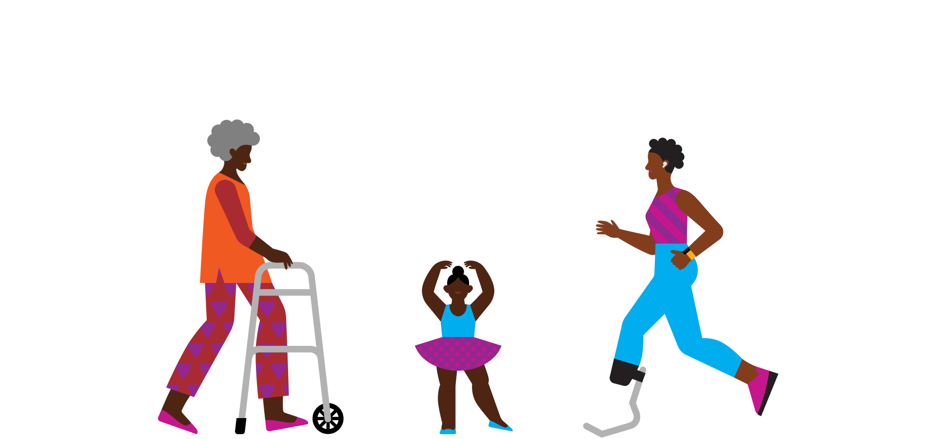
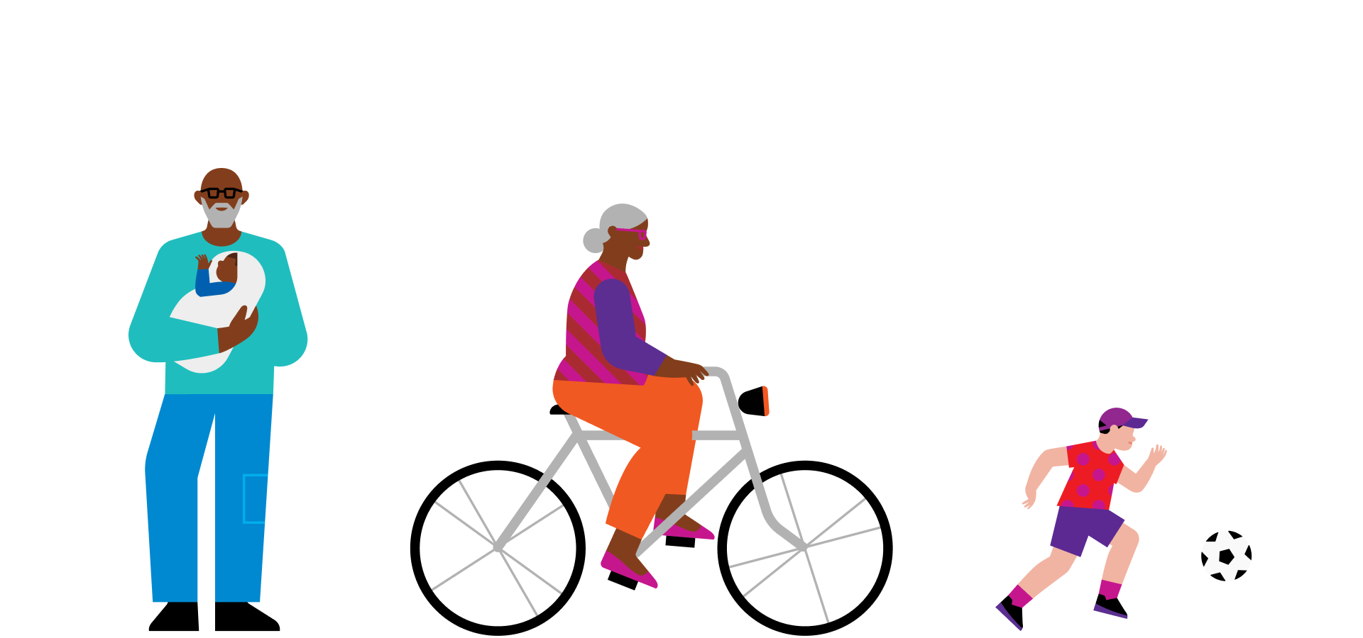
We designed more than 65 illustrated characters to enhance the inclusivity of the YMCA’s brand.
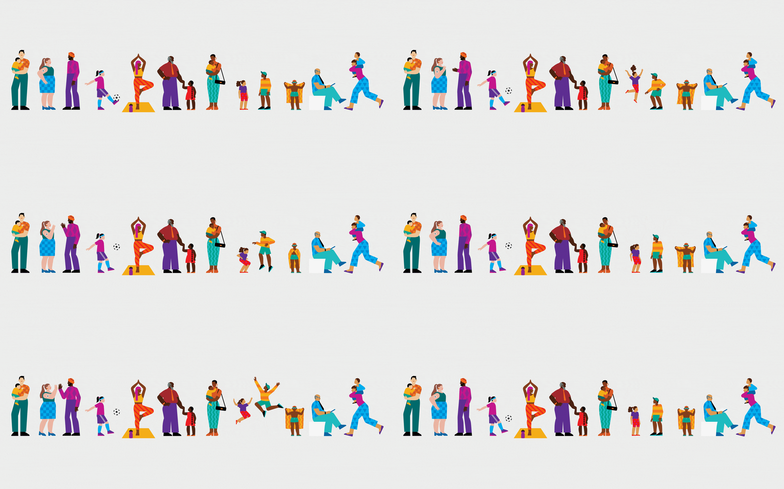
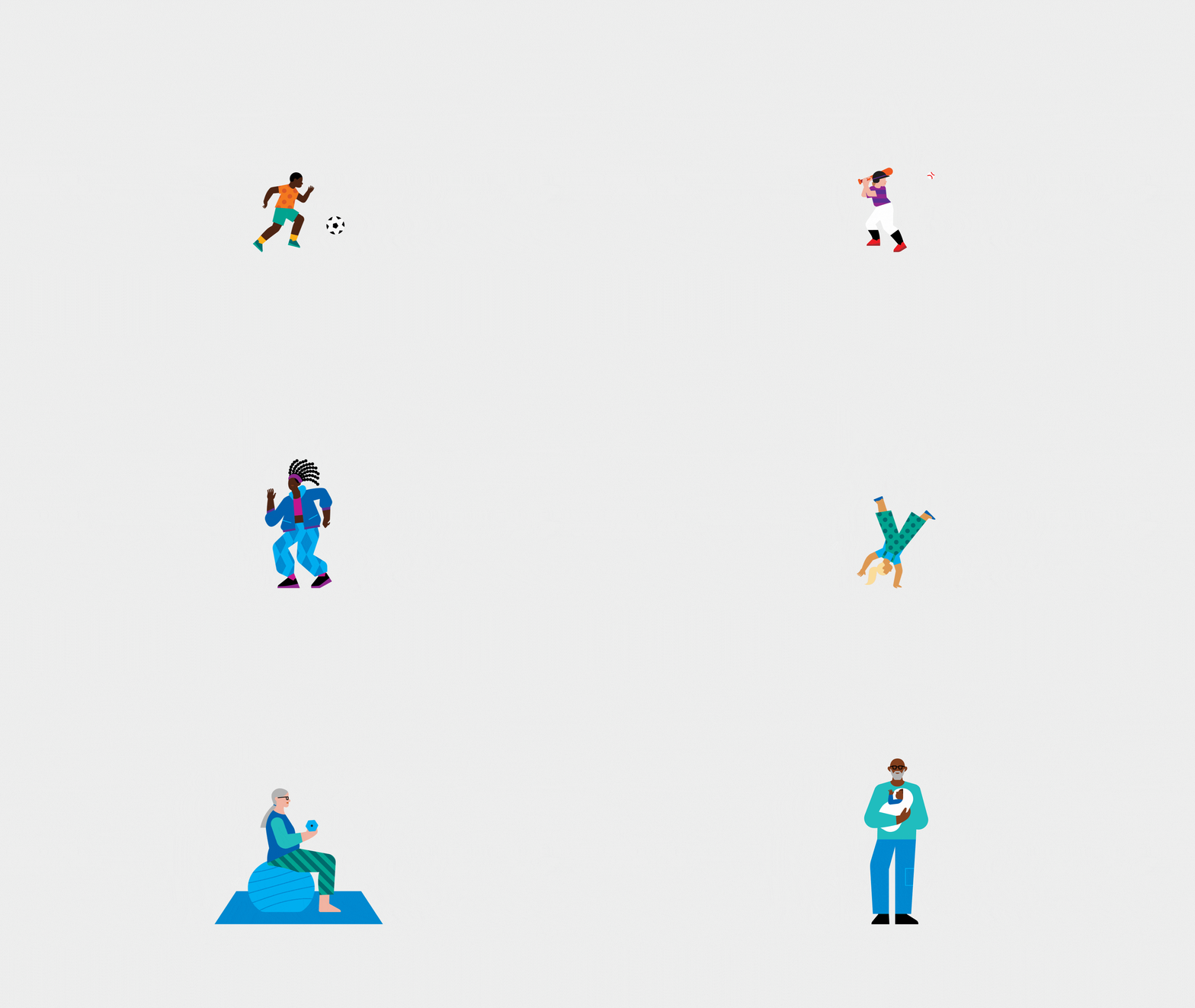
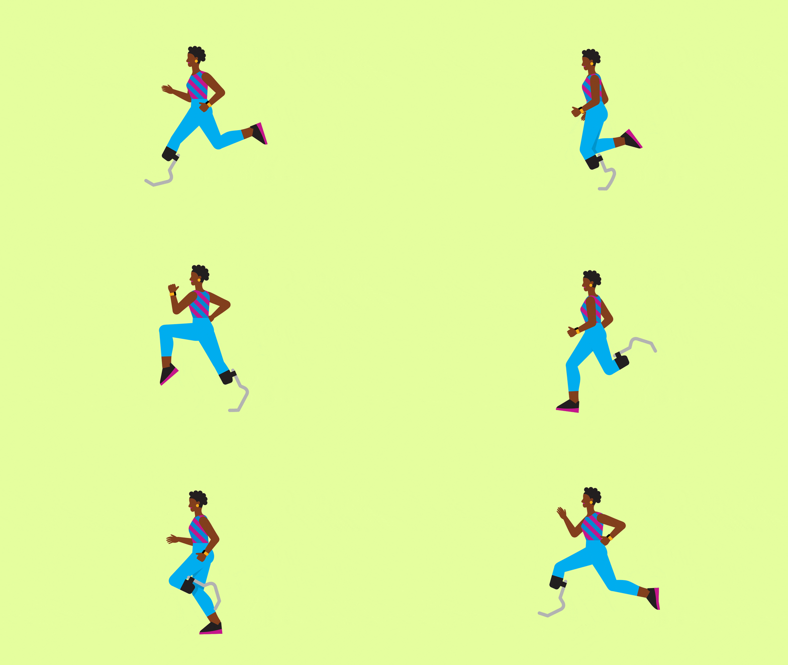
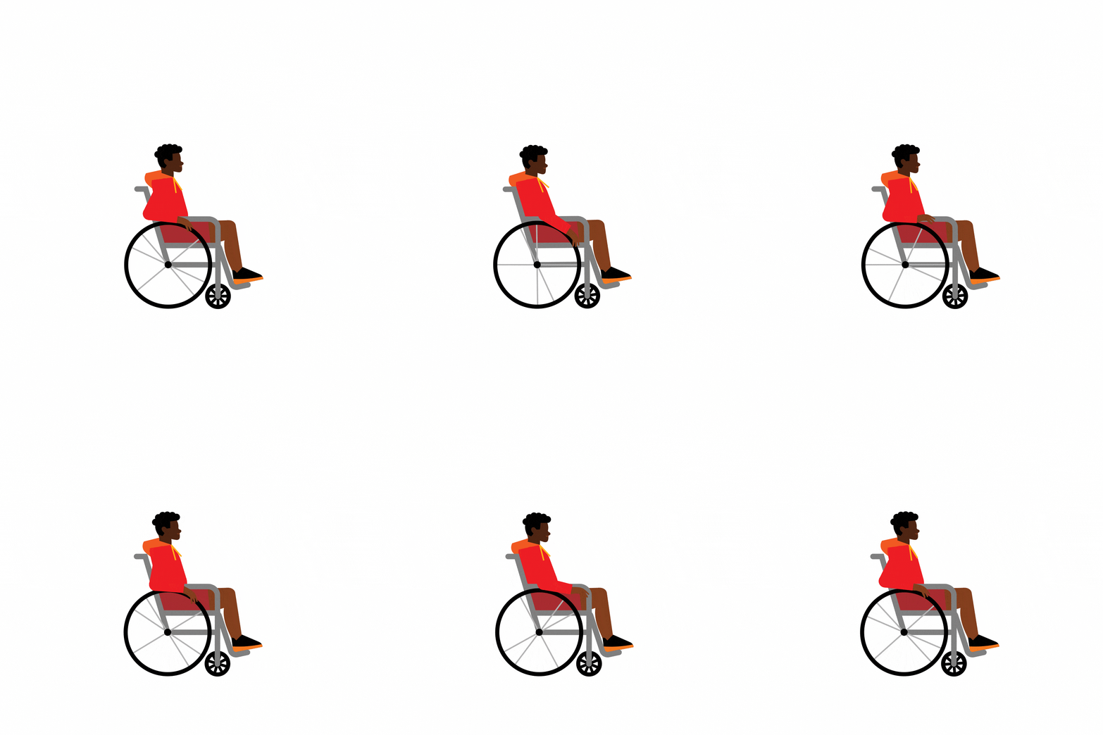
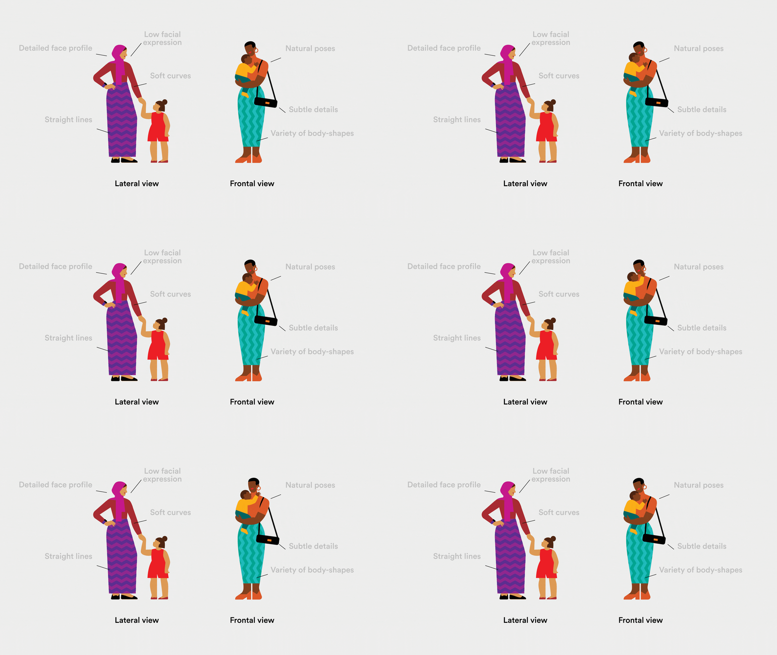
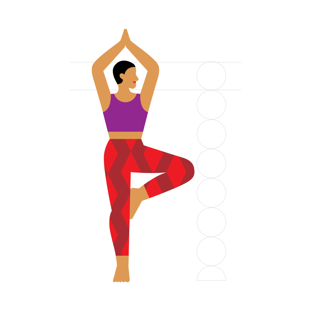
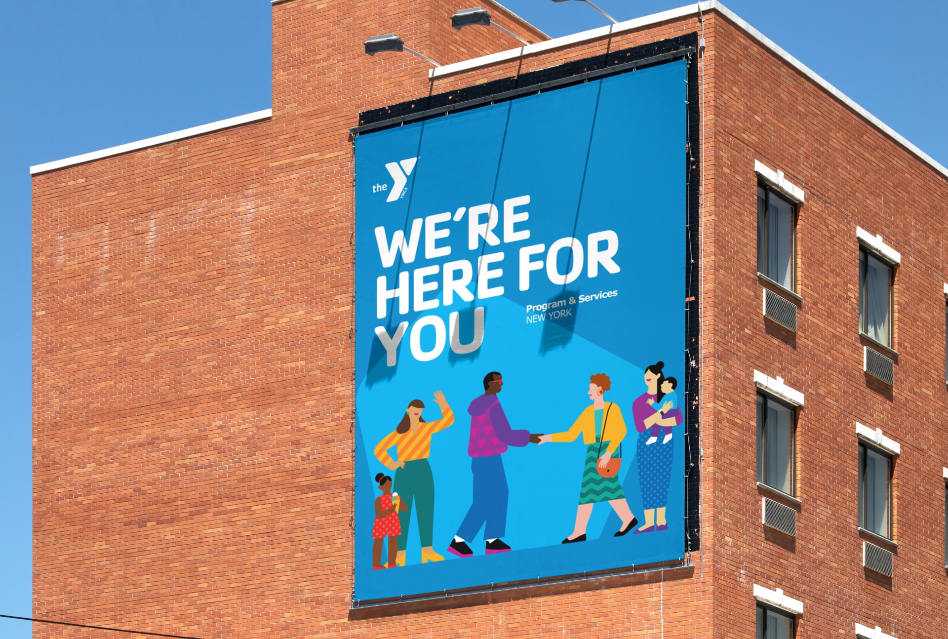
When VML&R reached out to us, we knew our design for the YMCA had to be as inclusive as possible. We're happy to share the illustration system we created for this global organization, dedicated to promoting youth development, healthy lifestyles, and social responsibility through a variety of recreational, educational, and community-building initiatives. The YMCA wanted to enhance its brand by adding a series of illustrated characters (and some contextual scenes) to forge a stronger connection with its audience. The goal was clear: we needed to engage a very wide and diverse audience. We were excited to contribute by offering a range of illustrations broad enough to ensure no one felt excluded while also promoting inclusivity across age, culture, and abilities. When designing this range of characters, we aimed to make them feel as real as possible, steering clear of anonymous and generic looks. When working with a vector style, characters can easily end up looking static and lacking dynamism, so we focused on using a simple and clean design, emphasizing natural and often dynamic poses. To clearly reflect the YMCA's branding, we used their color palette and added a bit of liveliness to some illustrations by creating short animated loops.



Incomplete animation







Credits — Creative Direction Cristina Pasquale + Illustration Anya Derevyanko + Animation David Cubitt + Producer Daniel Ceballos
