Round Brand identity
Going full circle: we created a fintech world with elegant colors, swift movements and dynamic shapes.


Check it on — Behance project + Instagram Post n 580 + Post n 582
Logo — We created the logo starting from GT Super, a well-balanced typeface, that strikes the right chord between elegance and a modern spirit. We adapted it to better suit the brand’s necessities, adding also a rounded dot for a more distinguishable look.
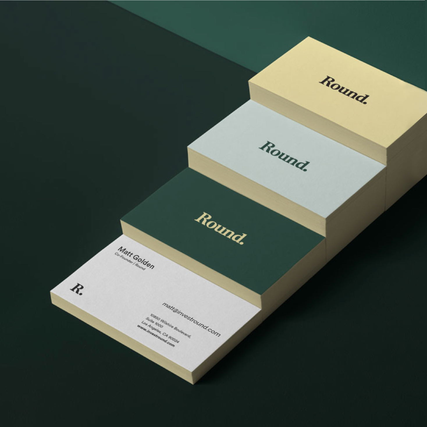

Color palette — We opted for a color palette that felt both elegant and stable, but with a twist. Going from neutral grays to solid greens, across tonalities of sand and gold, we relied on strong contrasts to generate a confident, smart look.
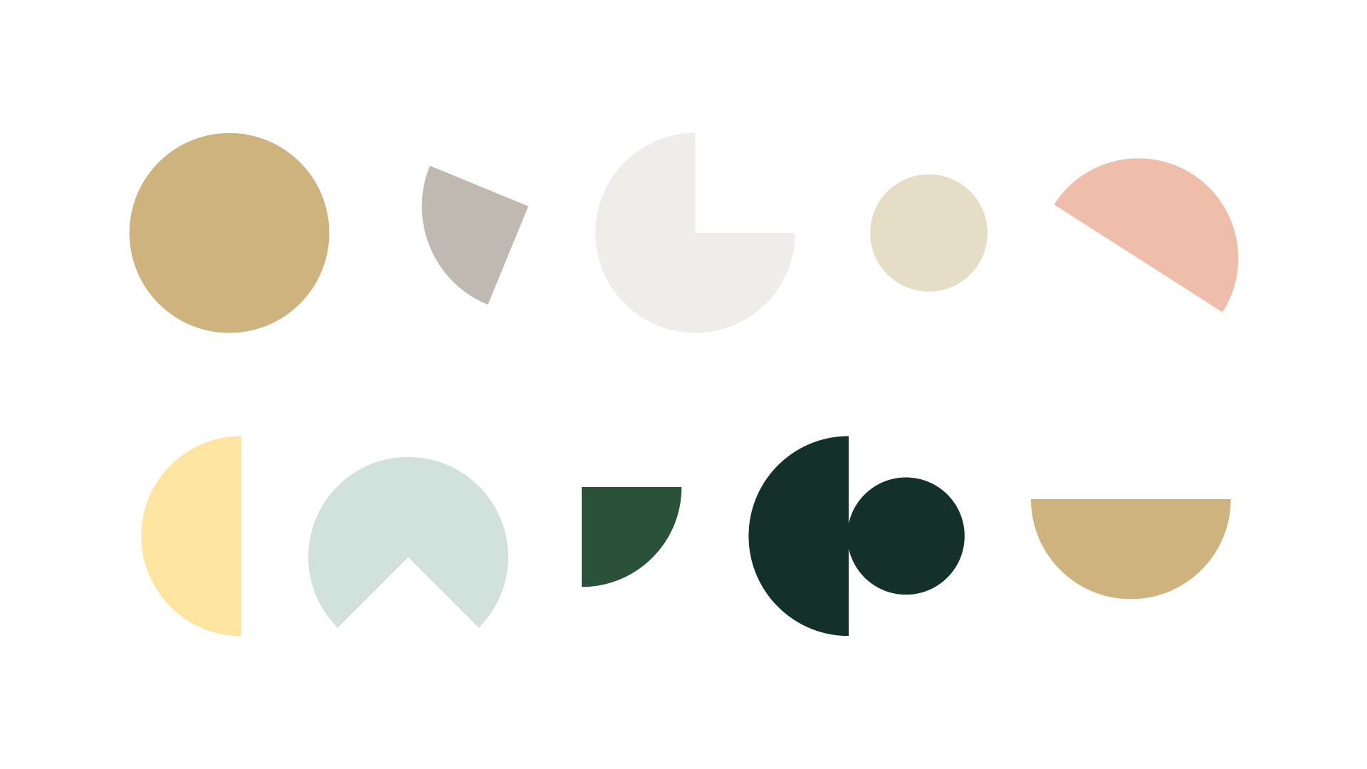
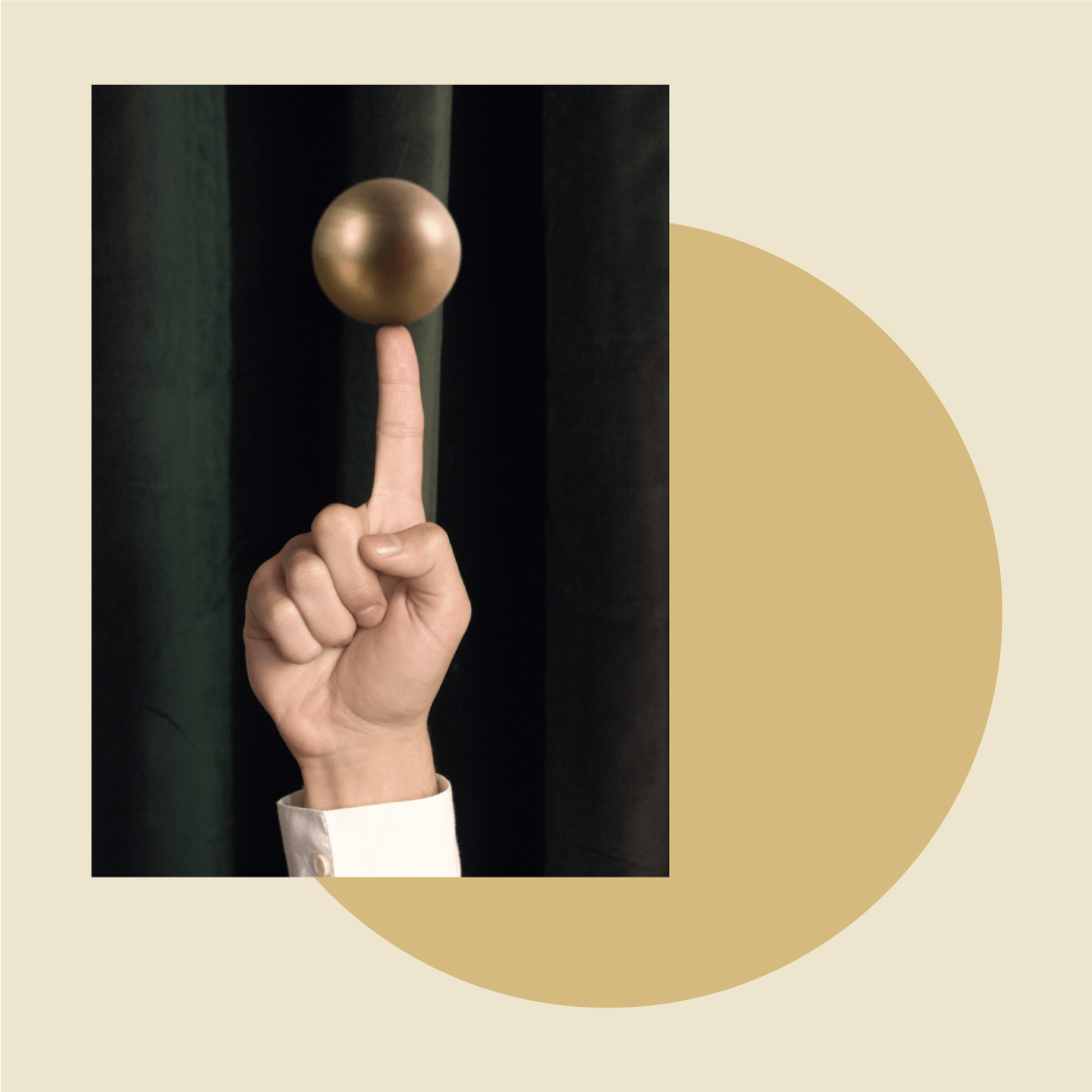
Visual assets — We used set design to express some of the main concepts with key visuals. From the spherical golden elements, to the velvet textures and lush details, it all came together with the tech details. Illustration wise, we built the clean graphic representations around the same recurring round shapes with sinuous lines for a complete, coherent look.





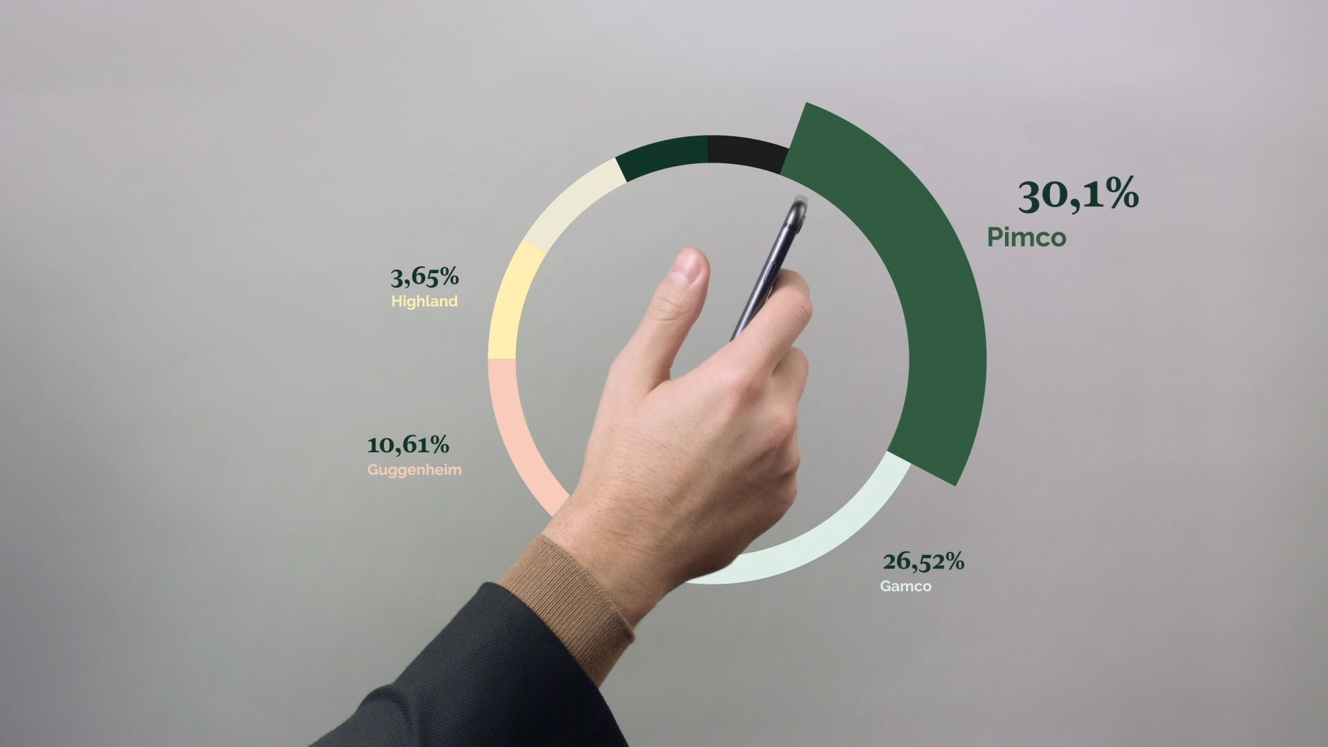
Brand video — Simple storytelling, dynamic movements and stylish takes: the video we created in set design aims to clearly explain how the app works, while also creating the coordinates for the brand’s visual world.
Website — We opted for an elegant, yet relatable look for a fresh take on the classical fintech world representations. Bold images mix with the brand’s color palette, while the text blocks have plenty of space to breathe, making it easy to follow the information and to navigate the website.


App — We started with a previous version of the app, working to adapt its design to the new branding style. We added the contrasting colors and the dynamic, recurring shapes and kept the UI design clean and easy to use.
Credits — Creative Direction Ilenia Notarangelo + Art Direction & Design Lead Arianna Cristiano + Branding & UI Arianna Cristiano, Flavia D’Anna + Design & Photo Post-Production Sofia Buti + Video Animation & Editing Laurentiu Lunic + Video Producer Ani Karamanukyan
