Google Chrome Enterprise
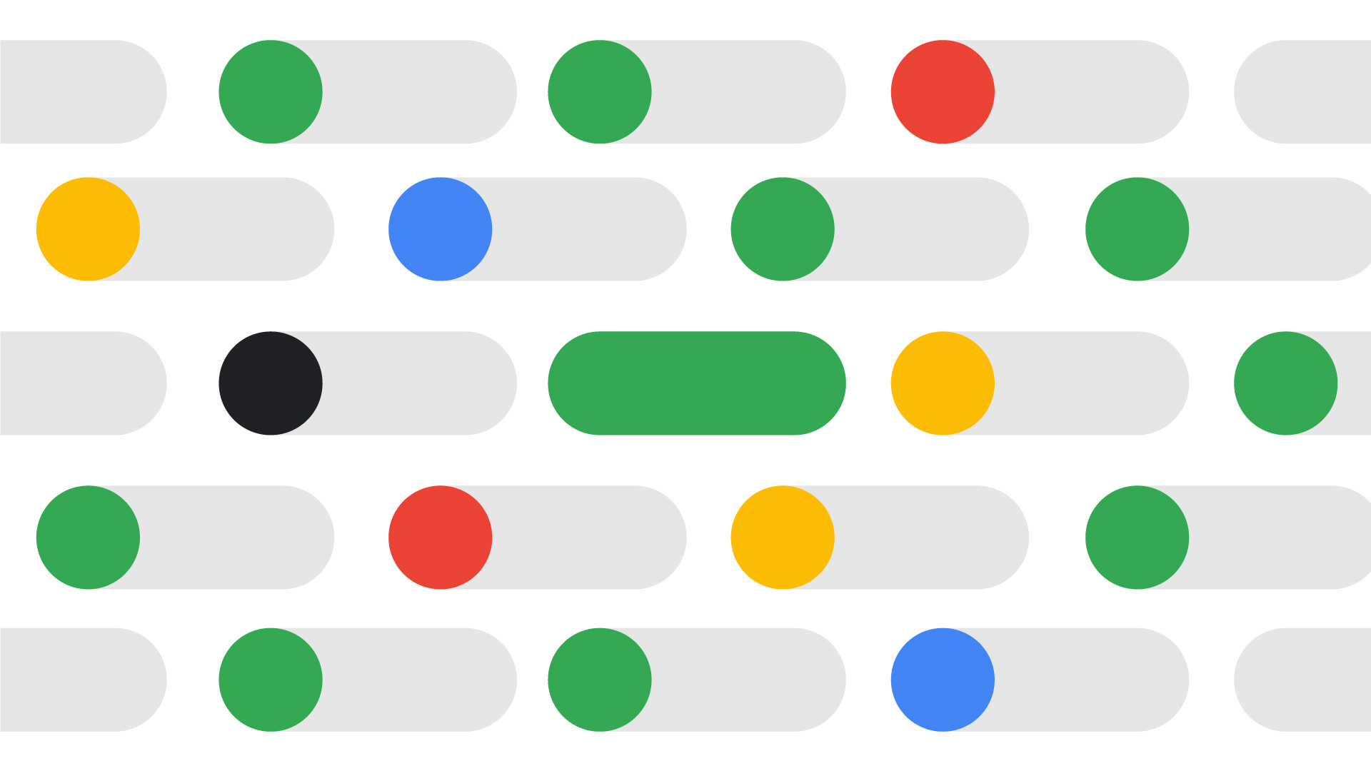
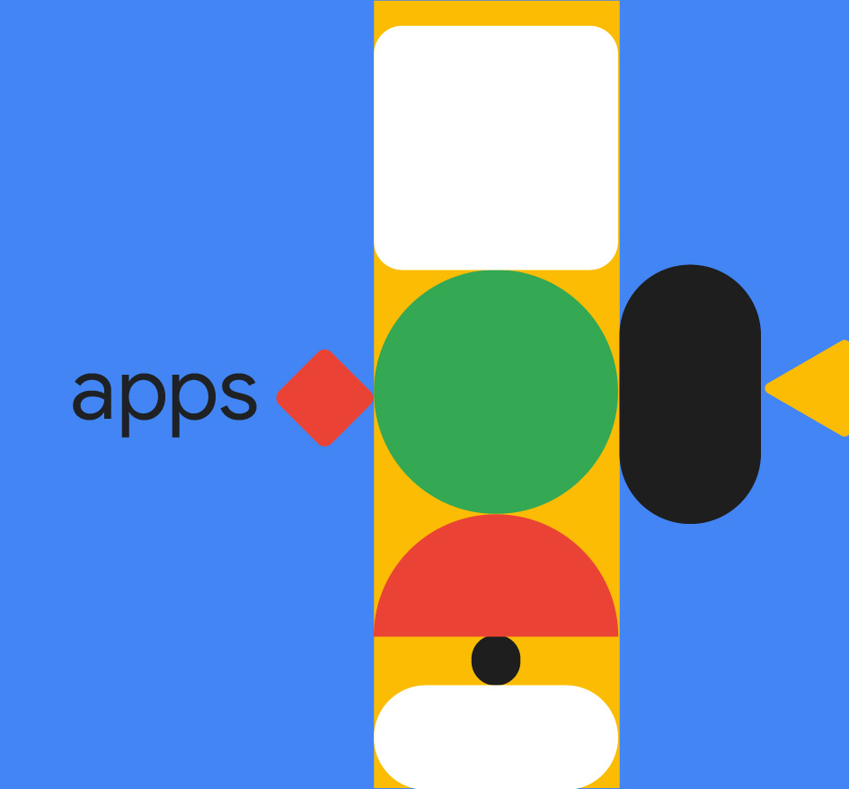
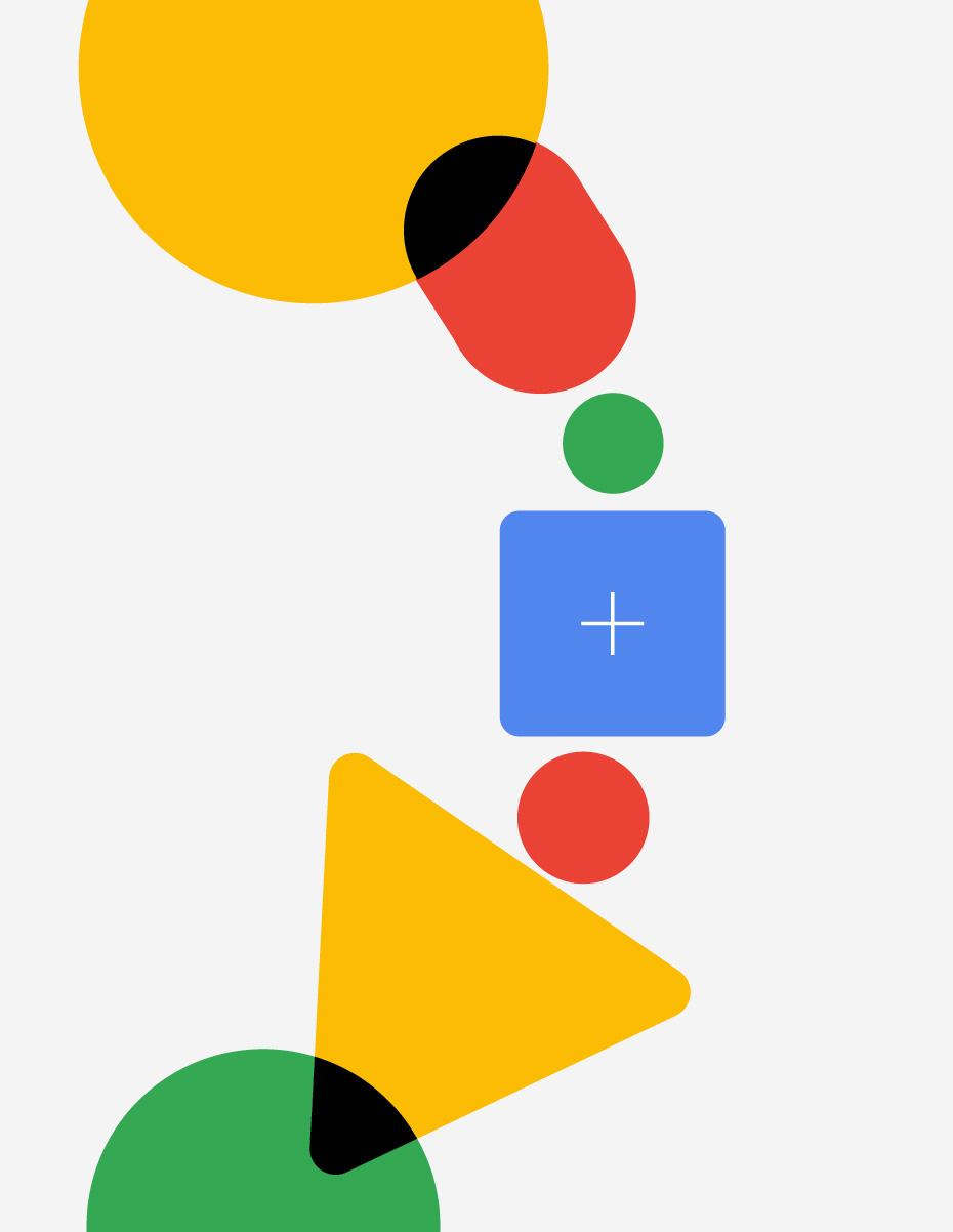
We created two videos full of colorful shapes & sleek typography animations to present Google Chrome Enterprise.
Check it on — Behance Motion Graphics & After Effects featured + Instagram Post n 584 + Dribbble Post n 234 + Motion Design Awards Video of The Day + Digital Design Awards DDA of the Week
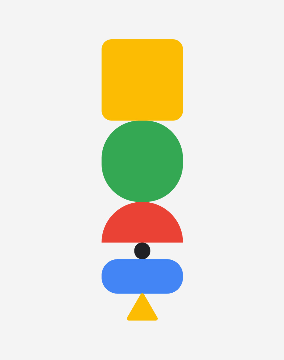
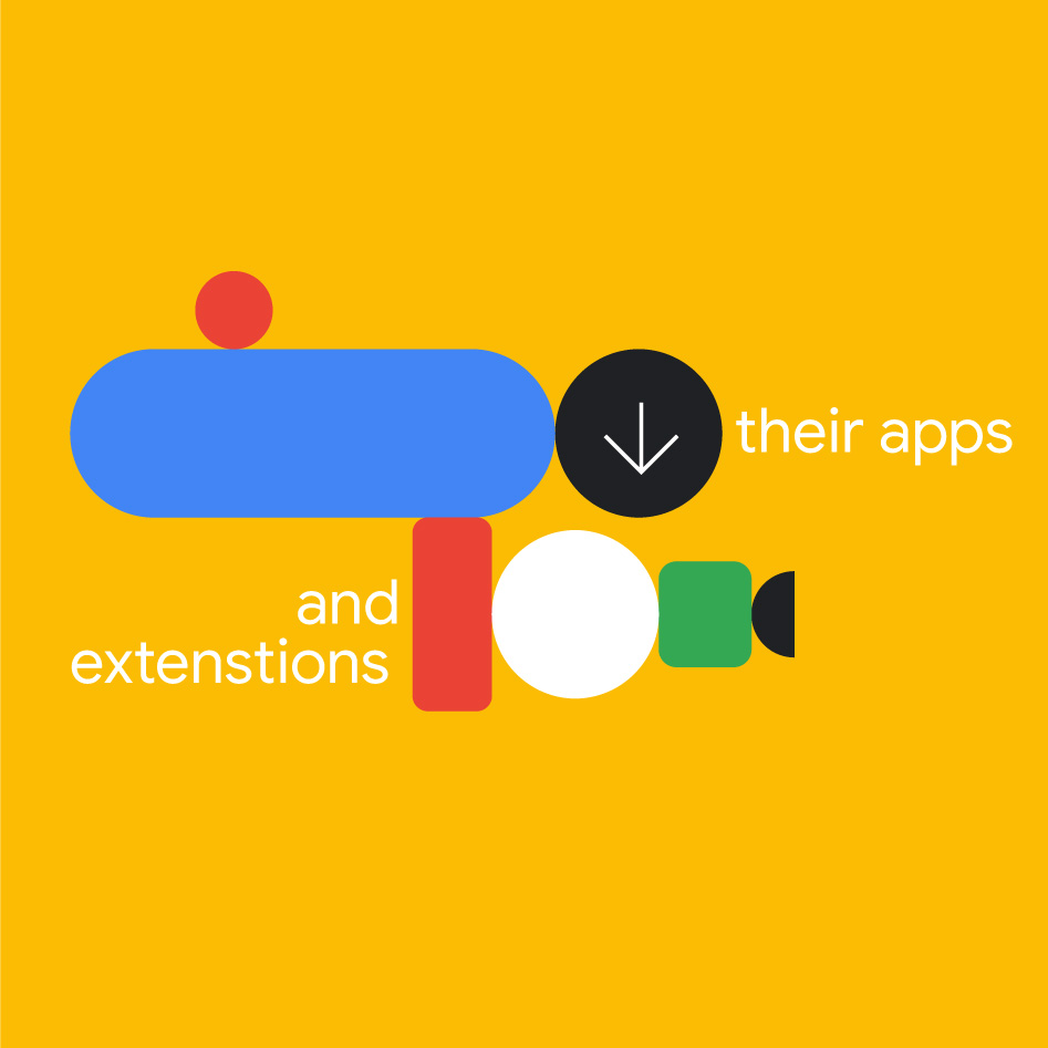
We played with the search bar element, colors and shapes, and decided to really get down to the essence of things with a very minimalistic visual approach that would allow for the message to stand out. Getting to play with such an iconic font also helped ;)
At the beginning of our creative process we had a more playful approach, exploring shapes and introducing more visual elements to the story. During the next phases of our creative direction we narrowed it all down to the bare minimum, focusing on the core elements of the video.

Credits — Creative Direction & Design Ilenia Notarangelo + Client Direction Luca Gonnelli + Design Lead Arianna Cristiano + Animation Lead Laurentiu Lunic + Animation David Cubitt + Agency Article Group
