alibaba.com Illustration system
Our first system for an Asian client, playing globally: a portal where dynamic characters and playful shapes explore endless possibilities.
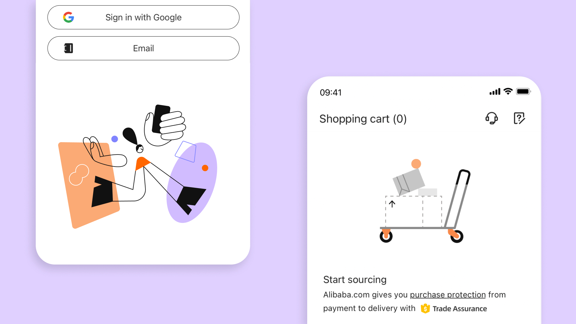
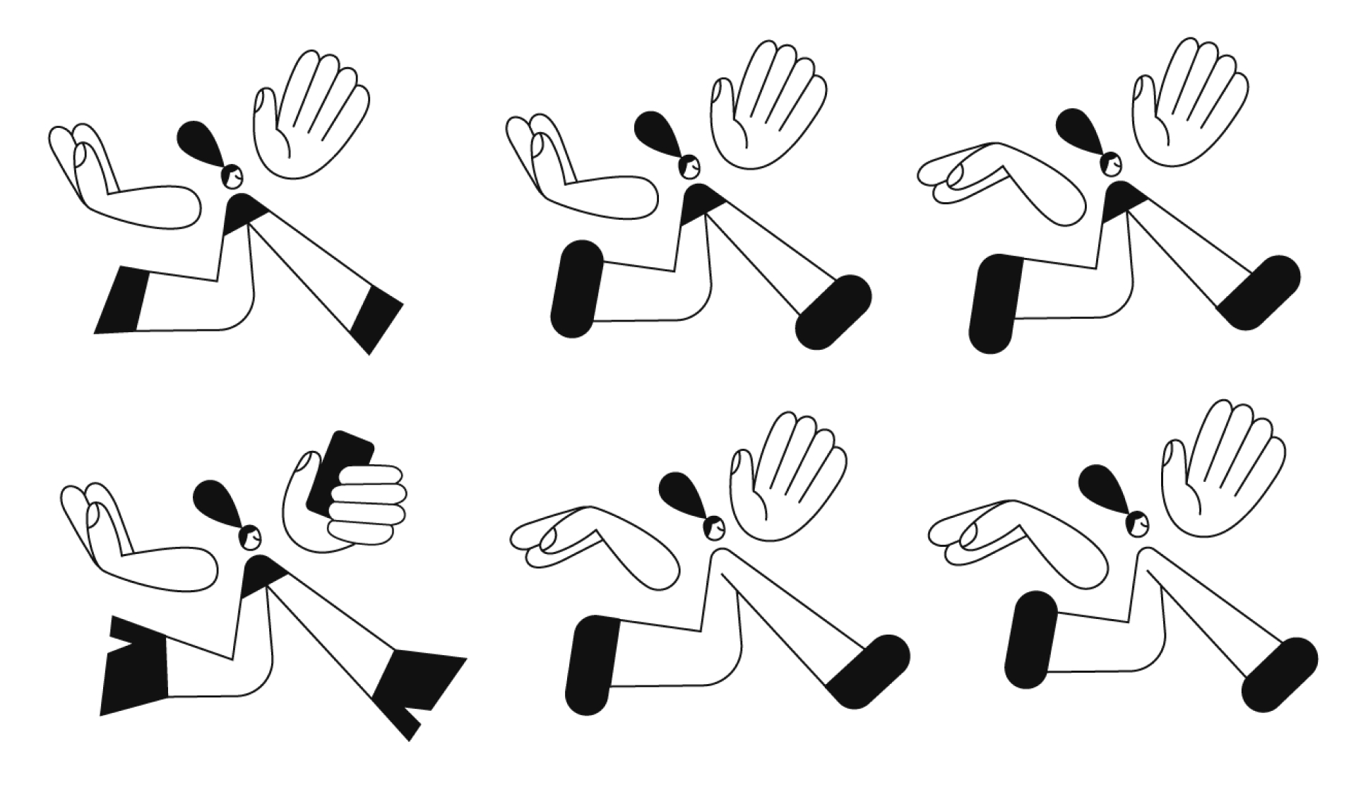
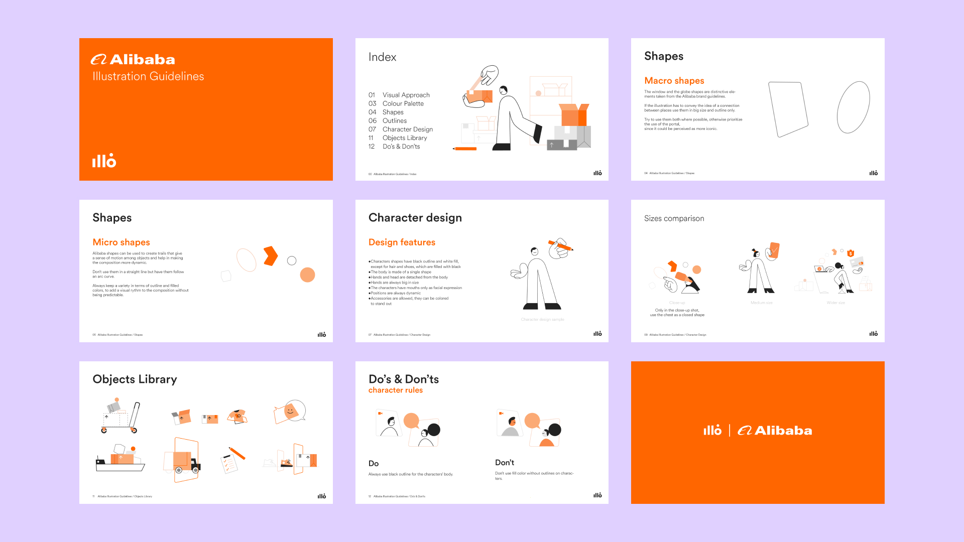
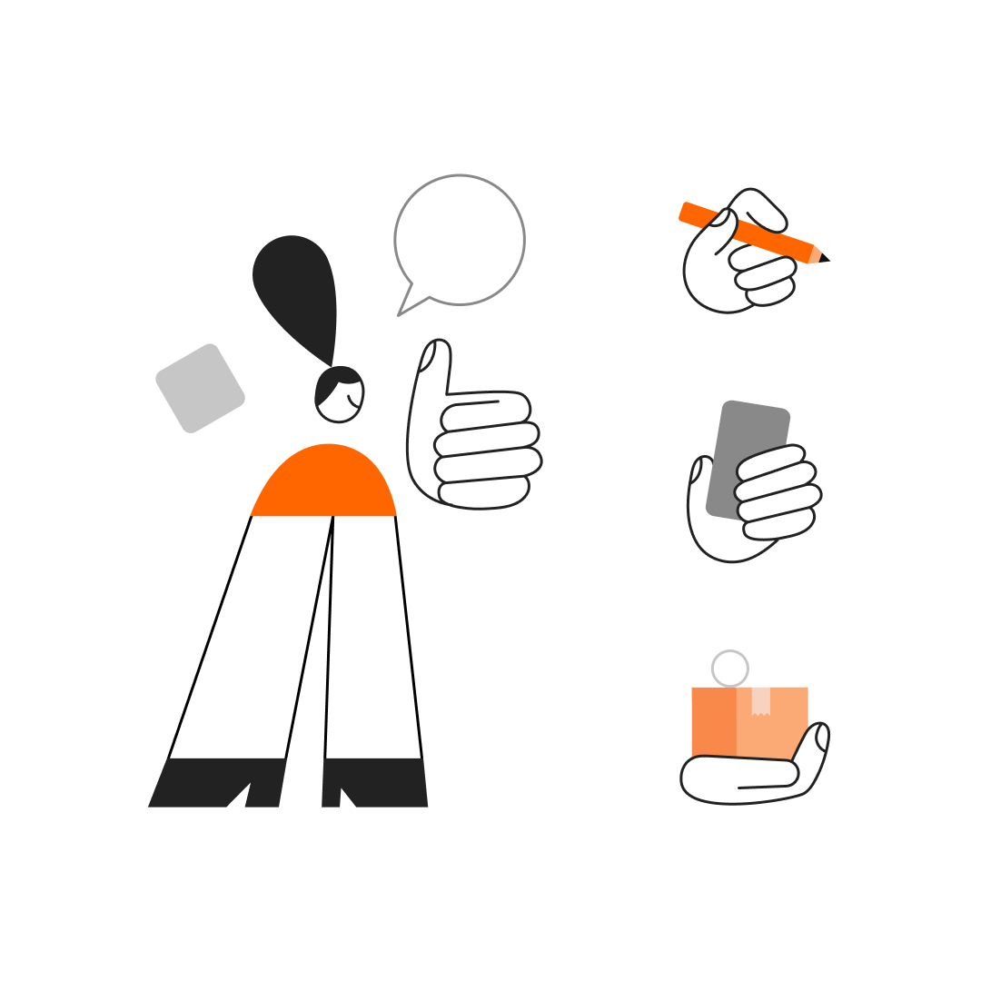
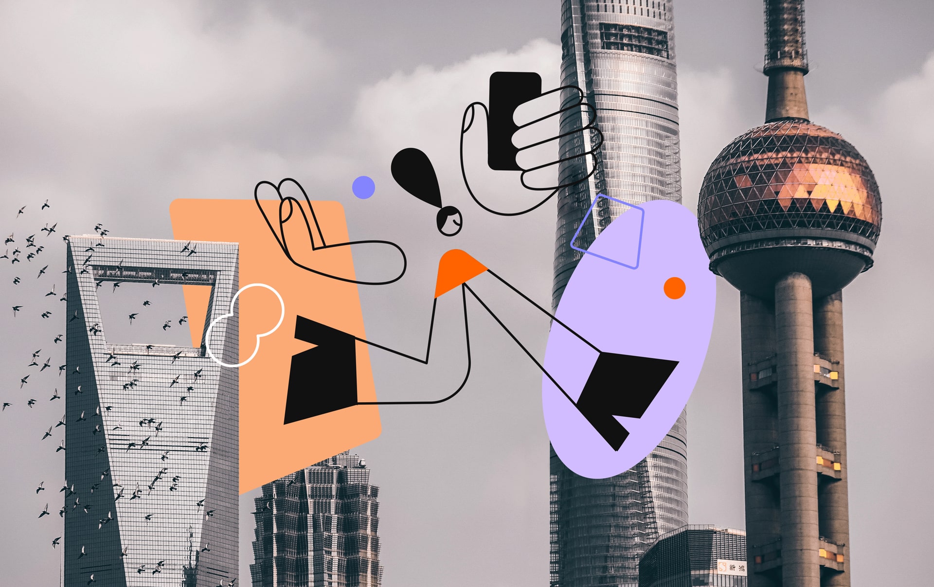
We realized that the direction was there when we merged the Window, Globe, dynamic characters, and playful objects, forming a portal of connection — Alibaba.com's seamless delivery service. We've also created guidelines, providing a launchpad for Alibaba.com's internal team and designers worldwide. Illustration systems are living things; we set the groundwork, but it's exciting to see how others will express concepts.
It’s our first big illustration project for an Asian client, but definitely not the last.
Check it on — Behance Best of + Instagram Post n° 922 + Mindsparkle Alibaba.com Illustration System + DDA Of the Month + Motion Design Awards Video of the Day
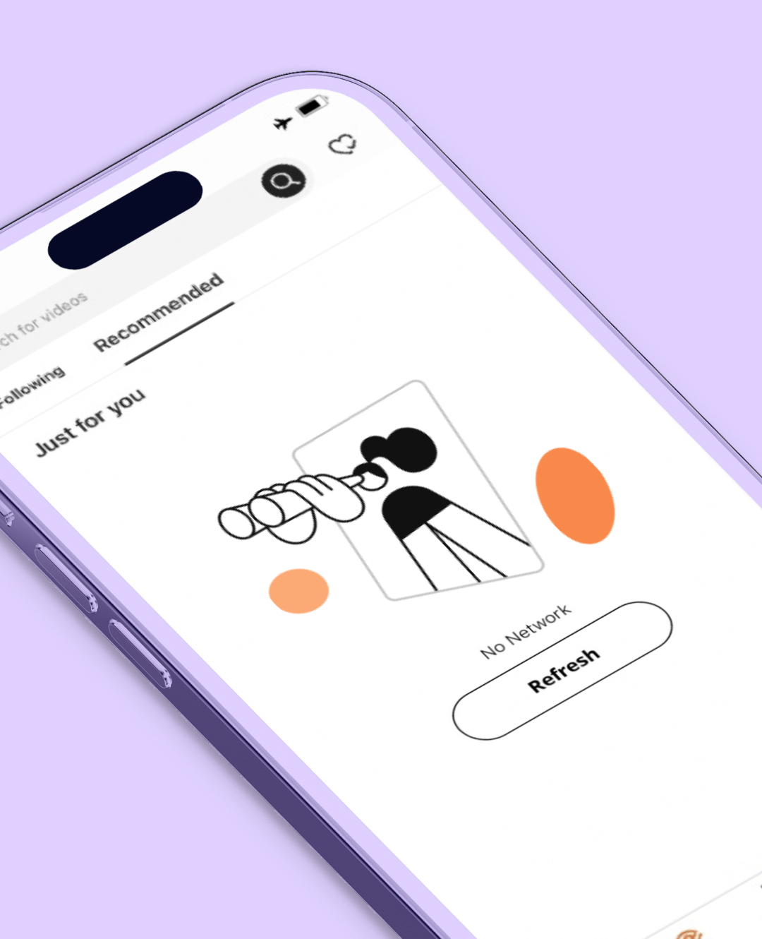
We were inspired by the two main and iconic elements/shapes that represent the Alibaba core brand, the window, and the globe. We tried to use them as the main shapes that, combined together, can create a magical and stunning experience. The idea is to use them to create a sort of portal of connection among places. Between them things and people can travel and move geographically from one place to the other, conveying one of the most important Alibaba's strengths, the delivery service.
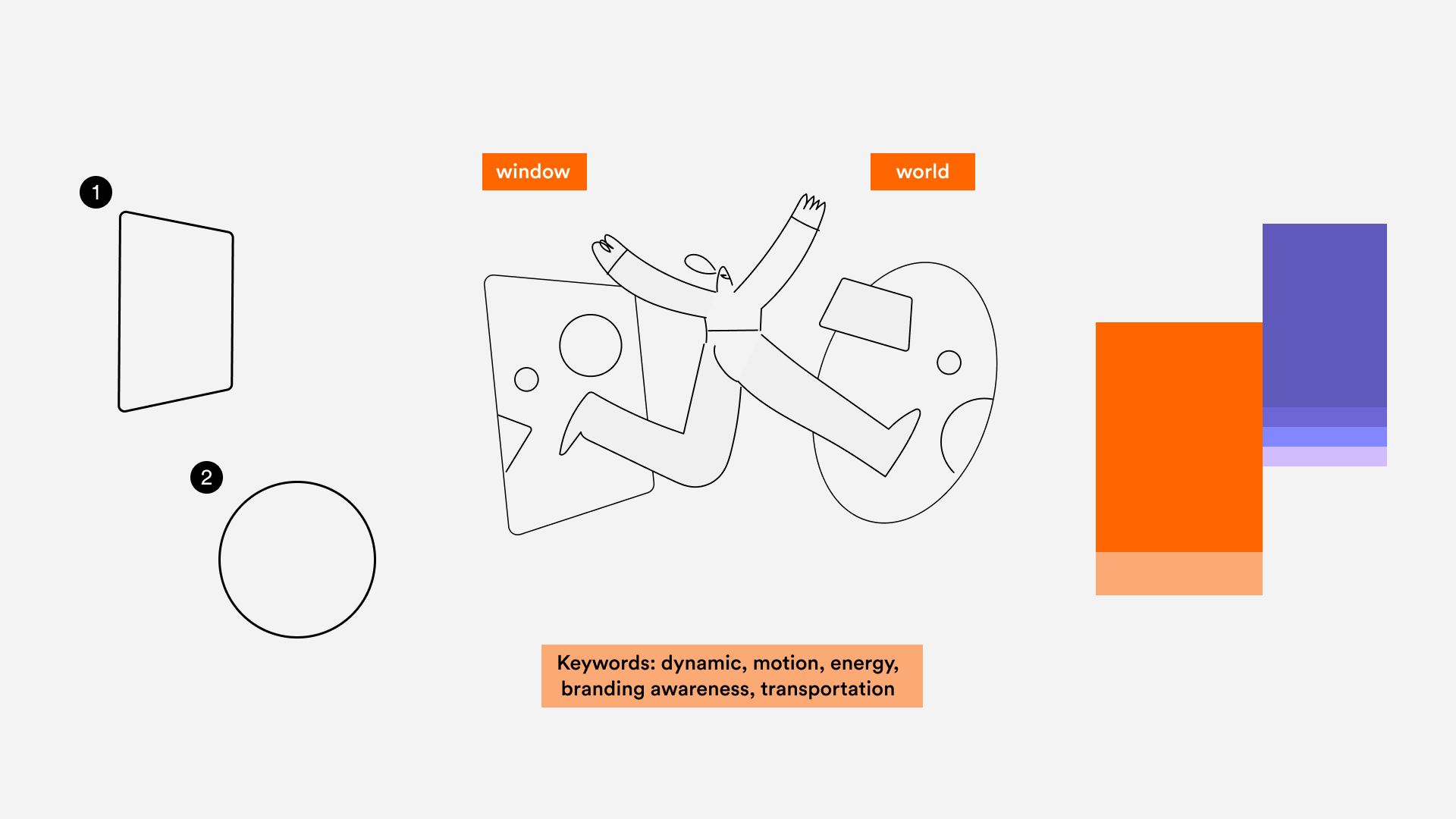
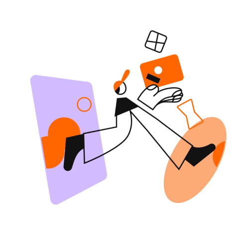
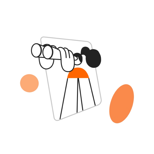
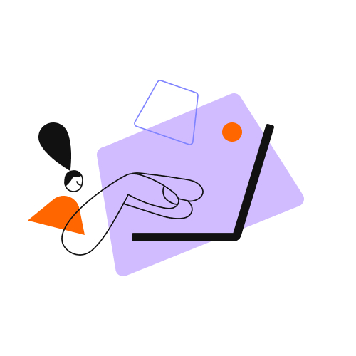
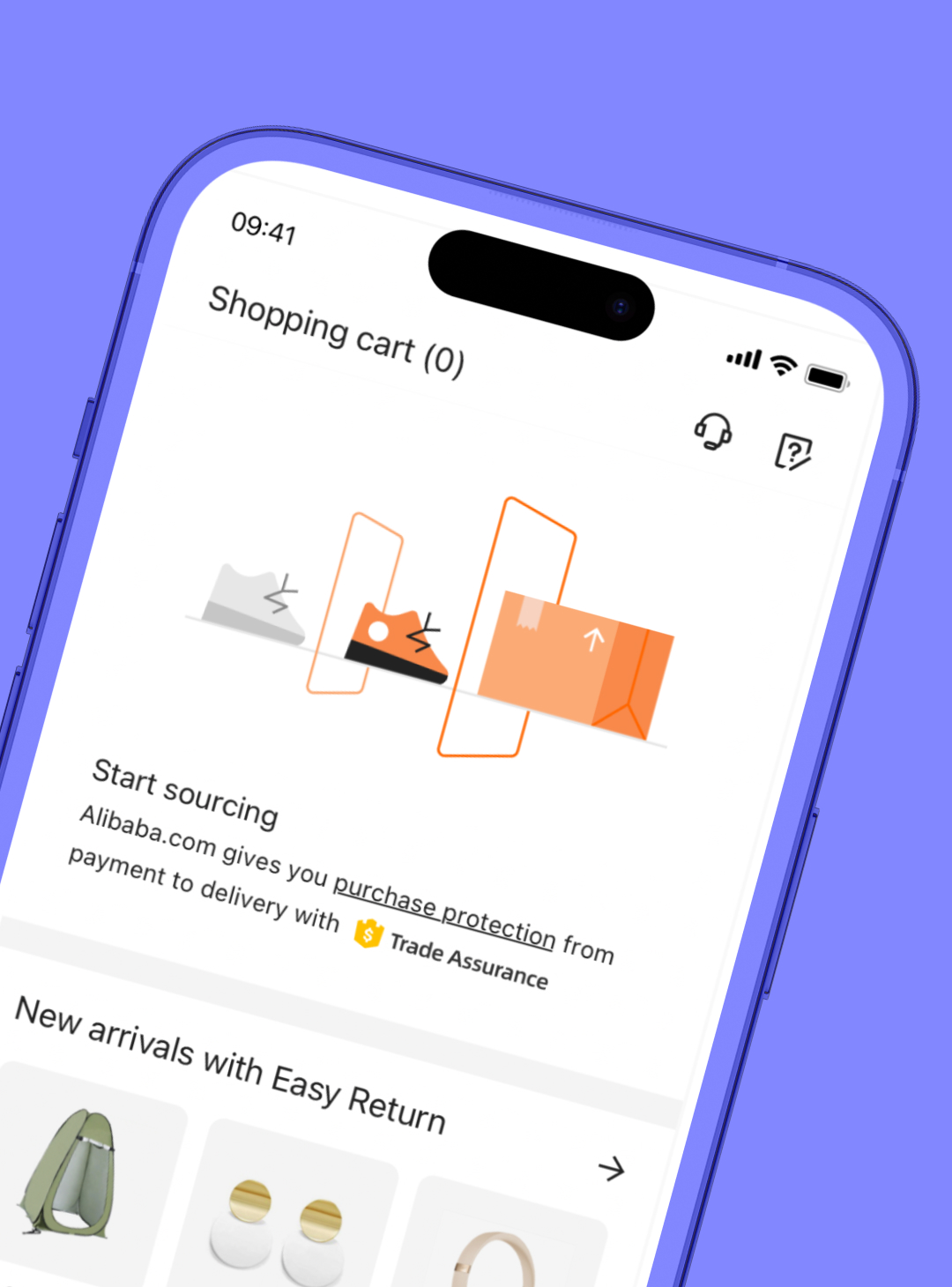
Guidelines are more than rules; they’re our creative blueprint. With the Alibaba.com Illustration System, we’ve not only designed captivating visuals but also provided essential guidelines. These aren’t rigid standards but a foundation, ensuring consistency across Alibaba.com’s global reach. These guidelines keep the system logical, assuring that it remains a cohesive and evolving entity. We’re eager to see how others will embrace this visual language, expressing their own unique concepts and ideas, all while maintaining the system’s integrity and coherence. Illustration systems are dynamic, and we’re excited to watch them grow.
Credits — Creative Direction Ilenia Notarangelo & Cristina Pasquale + Design Lead Sofia Buti + Animation Lead David Cubitt + Illustration Alessandra Marin + Animation Riccardo Chiara + Producer Ani Karamanukyan, Daniel Ceballos & Republic Studios + Portfolio Sound Design Fabrizio Martini + Portfolio Giovanna Crise
