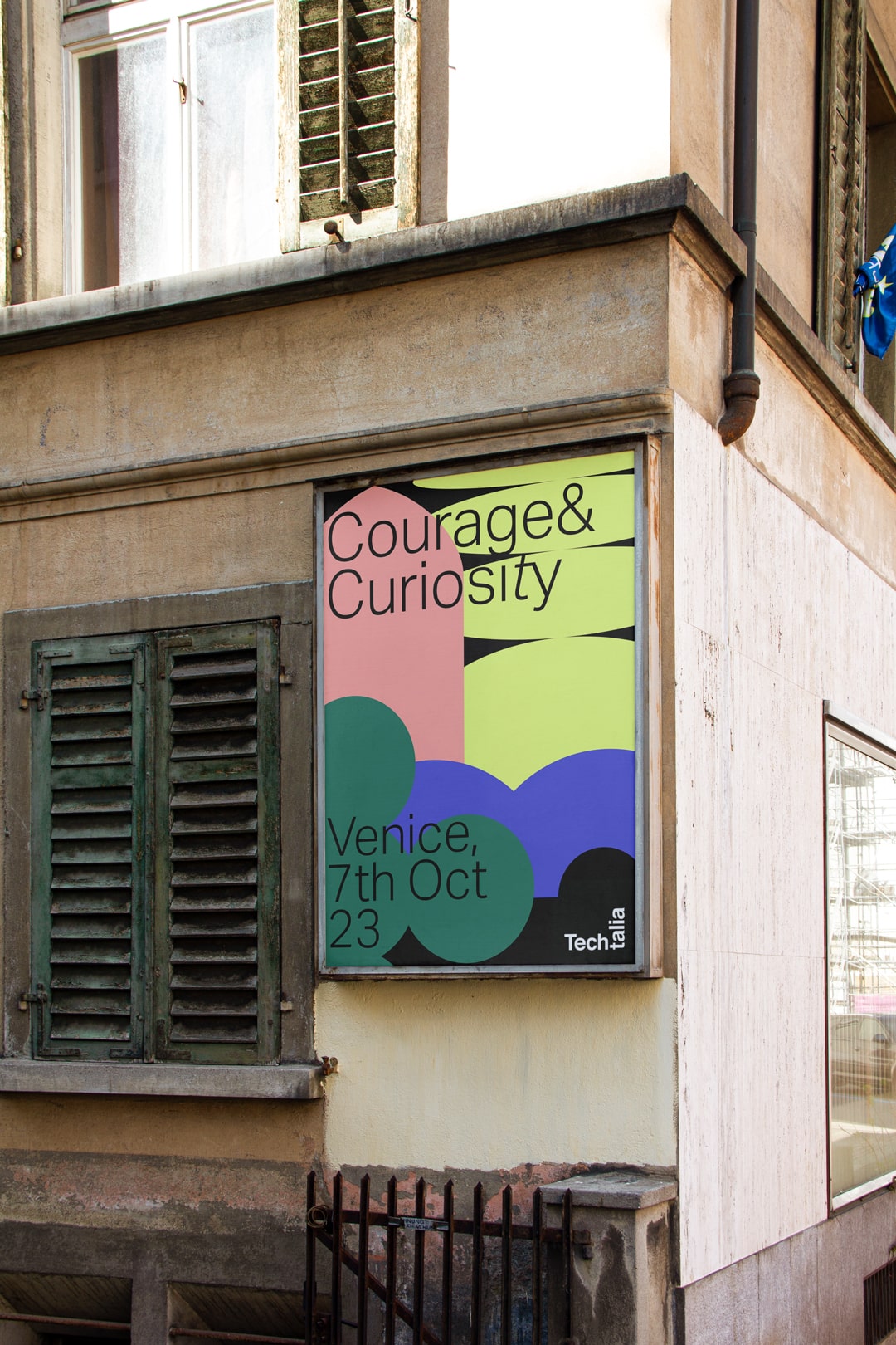
Techtalia Conference branding
We created the motion identity of Techtalia mixing typography and symbols blending the world of technology with the enchanting backdrop of Venice.
Check it on — Insta Post n° 927
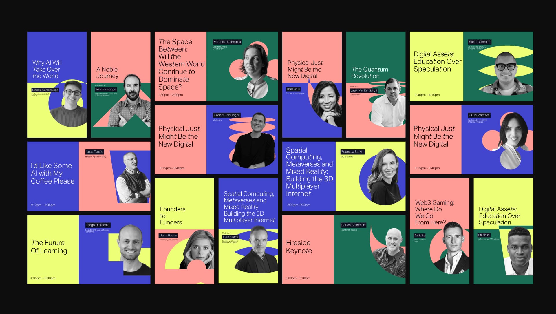
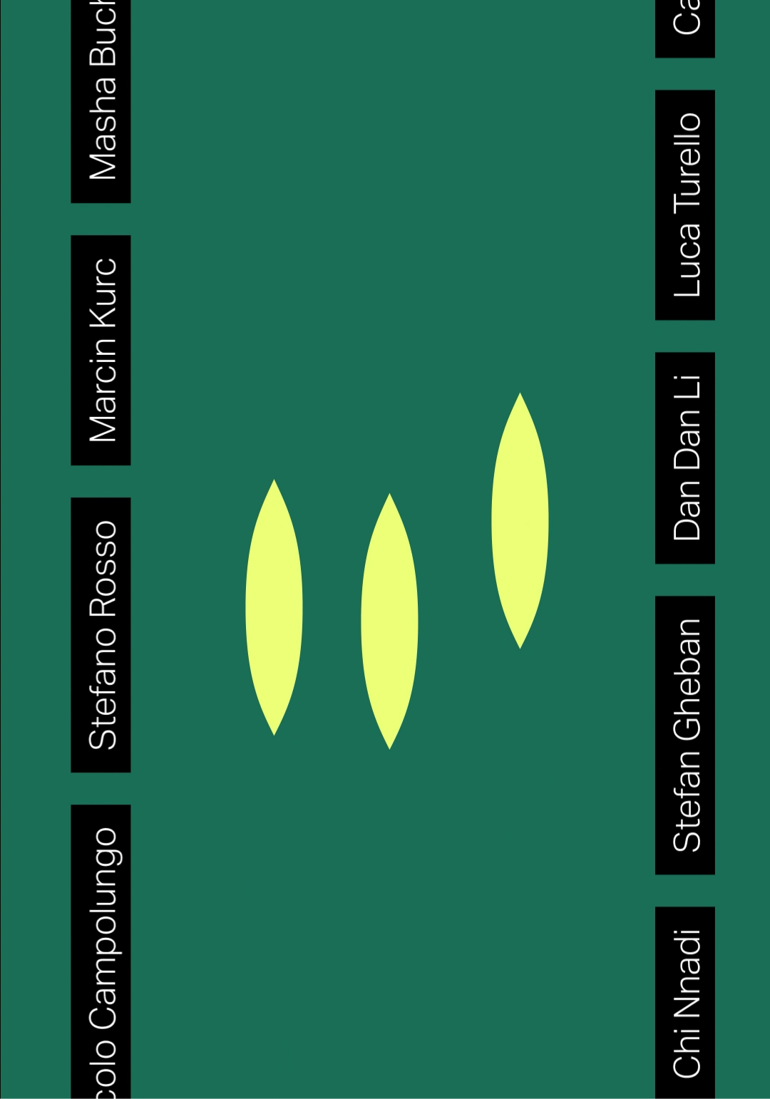
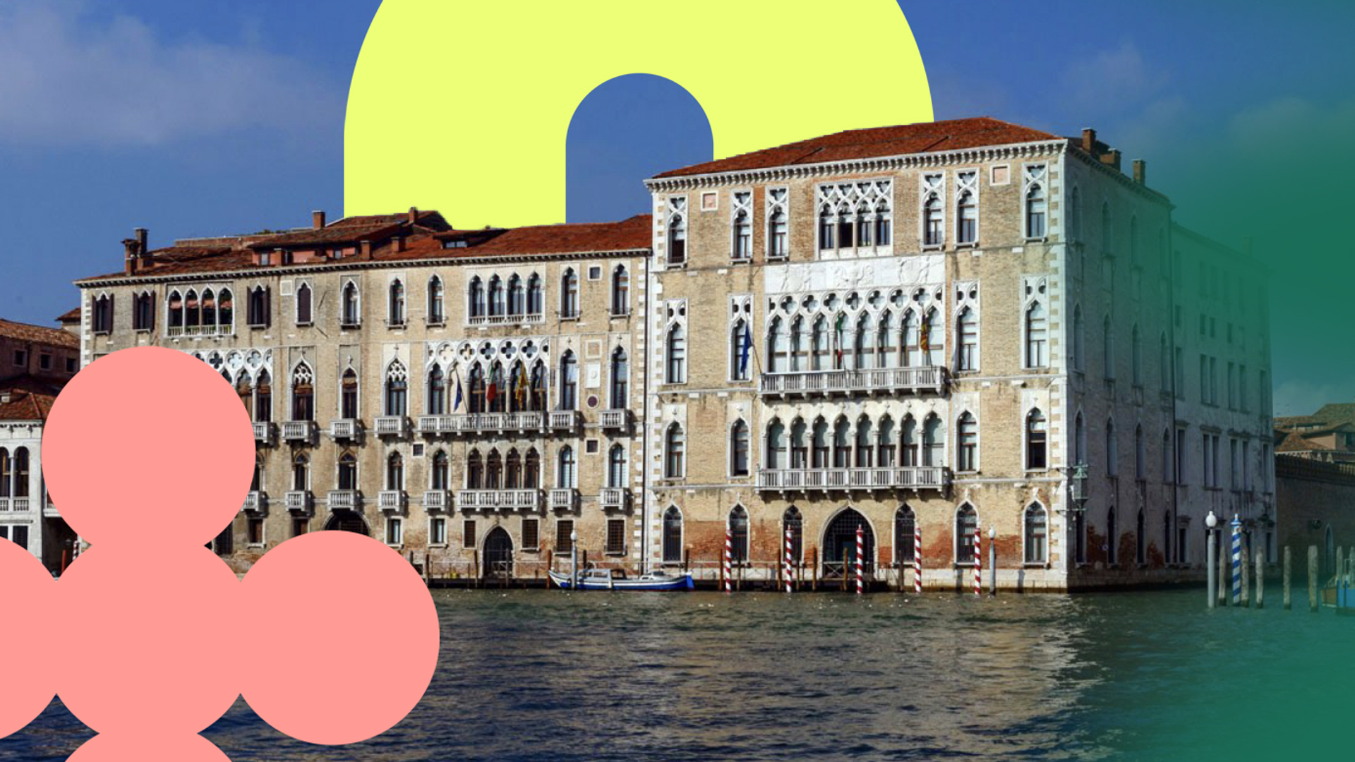
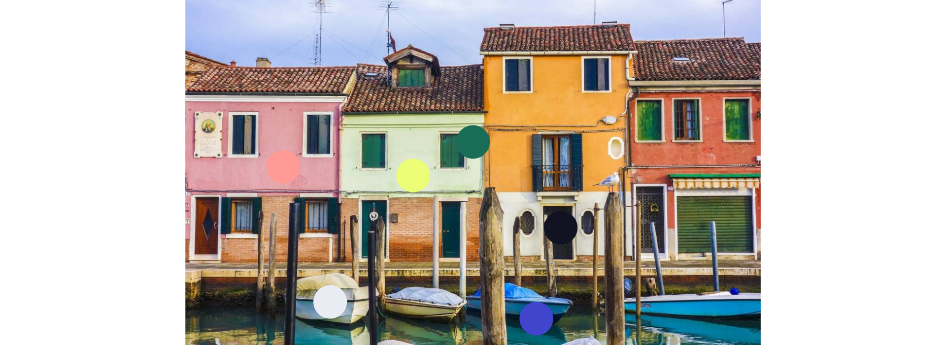
We curated 15 symbols to represent the elements that define Venice like the intricate bridges, the flowing water, and the architectural marvels, alongside tech-centric symbols representing connectivity, artificial intelligence, and more. We also get the inspiration for the color palette from the vibrant buildings in Venice and the nearby Burano. To create a diverse but consistent style the different colors were combined differently for every panel video.
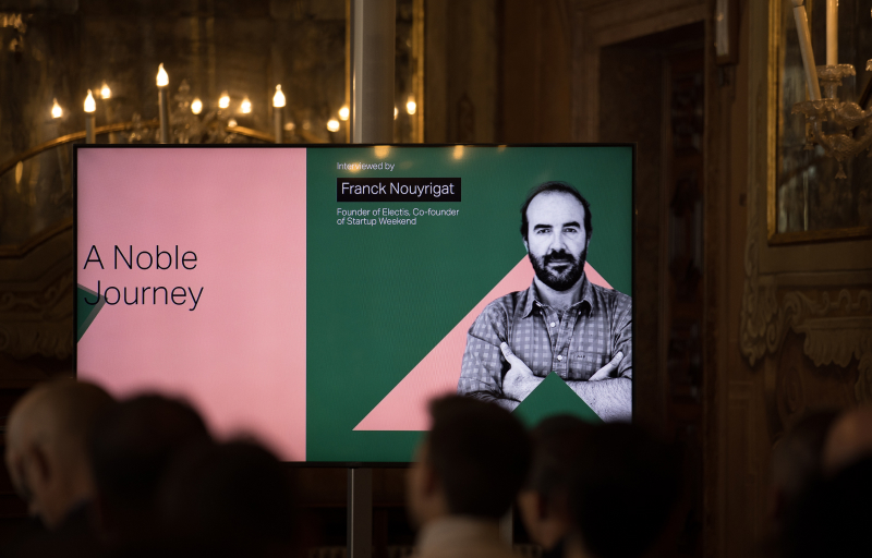
We also extended the identity to a wide array of applications presented into the event's identity, ensuring a consistent and immersive experience for all attendees.
Credits — Creative Direction Ilenia Notarangelo + Design & Animation Giovanna Crise