Storytel Visual identity
We crafted the new illustration and motion identity for Storytel, a global leader in the audiobook space, featuring bold, monolithic, and abstract shapes.
Check it on — Communication Arts Design Annual Award + Behance Best of + The Brand Identity illo’s expansive, expressive world of abstract shapes elevates Storytel’s narratives to new levels + FWA FWA of the day + Mindsparkle Storytel’s visual system + Brands In Motion Post n° 592 + Caffè Design Biscottini di Caffè Design n°35 + Motion Design Awards Video of The Day
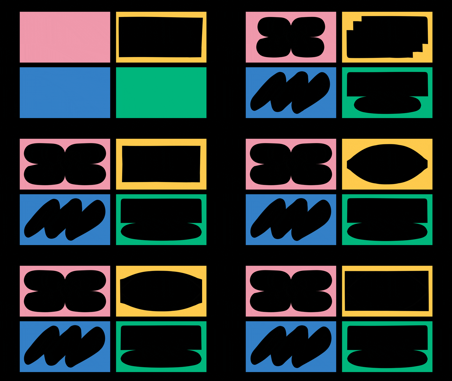
We wanted the shapes to be something anyone could draw, just as anyone can listen to stories. To achieve this, we focused on two key aspects: simplifying complex subjects into essential forms and combining bold colors—taken from Storytel’s palette—with organic, simplified shapes. This approach made the visuals both easy to understand and engaging. We designed the shapes to be versatile across all of Storytel’s communication channels, supporting users throughout their journey.
The system works seamlessly across both the product and marketing materials, enhancing the user experience by creating a consistent, vibrant environment that complements book covers with a distinctive aesthetic. The goal was to build a system that Storytel’s internal teams could easily iterate on and continue evolving as the brand’s needs change.

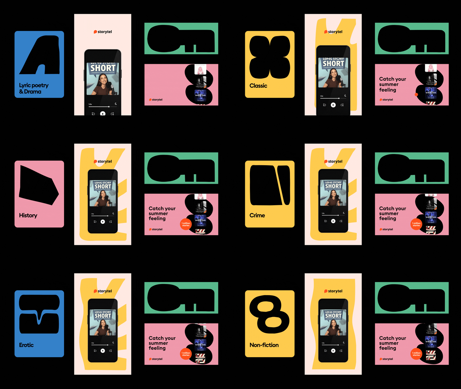

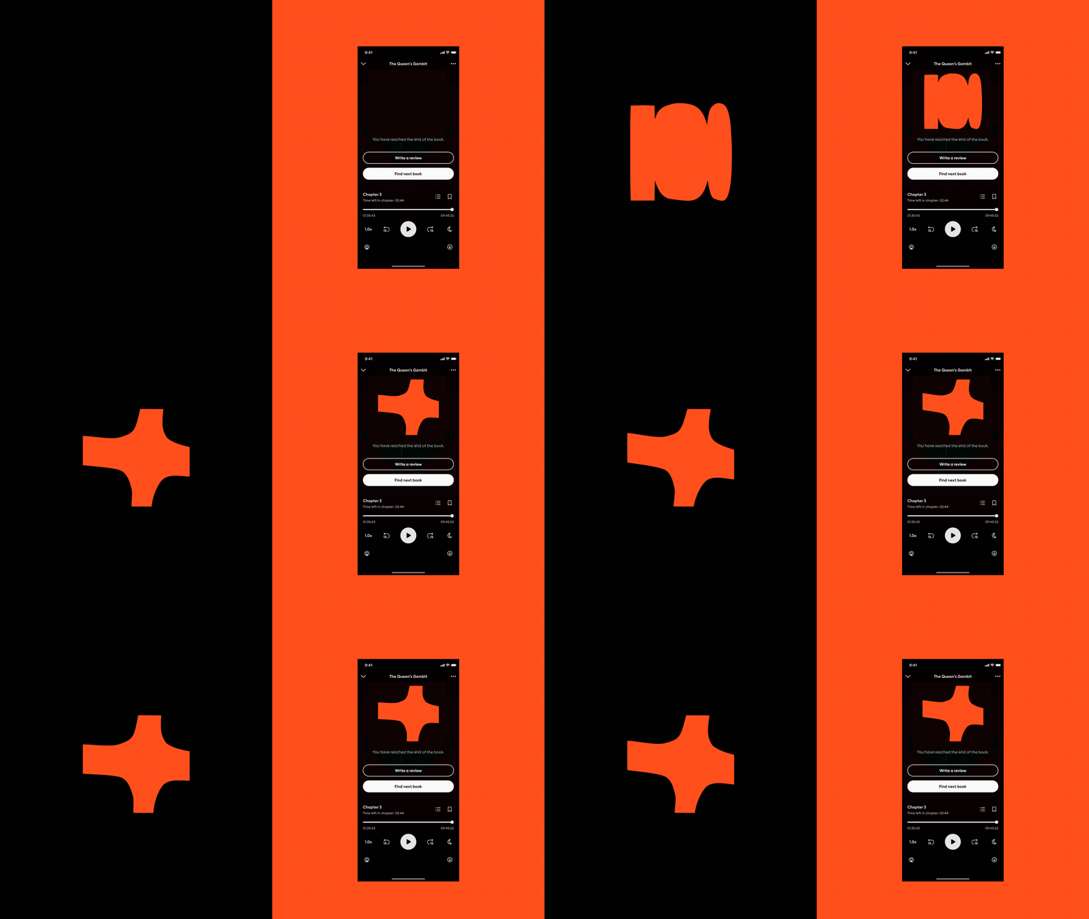




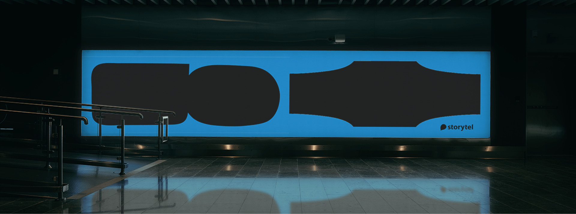
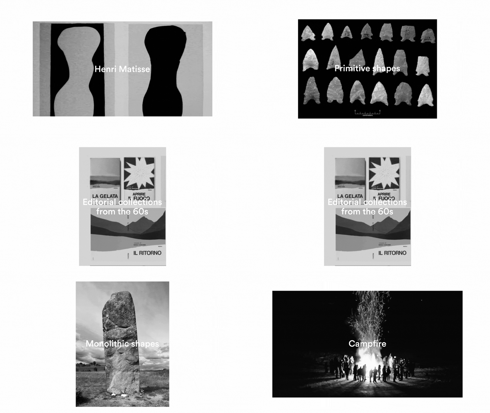
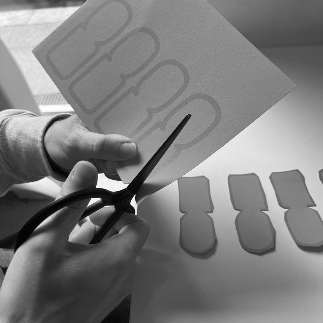
The monolithic black shapes form the foundation of this visual identity. The concept, tied to Storytel’s brand, draws inspiration from the campfire—those ancient moments when people gathered to share stories. Around the fire, large black shadows are cast, and these became the core of our visual style. To evoke the analog world, the shapes are intentionally imperfect, as if hand-cut from paper. This led us to define the key elements of the identity: bold, black, monolithic shapes—large, centered, and simple, blending rounded and squared corners to mimic campfire shadows. The overall aesthetic feels primitive and raw, as though drawn in a single, deliberate gesture, capturing both the timelessness and the warmth of storytelling.
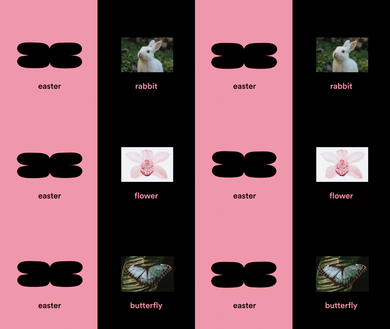
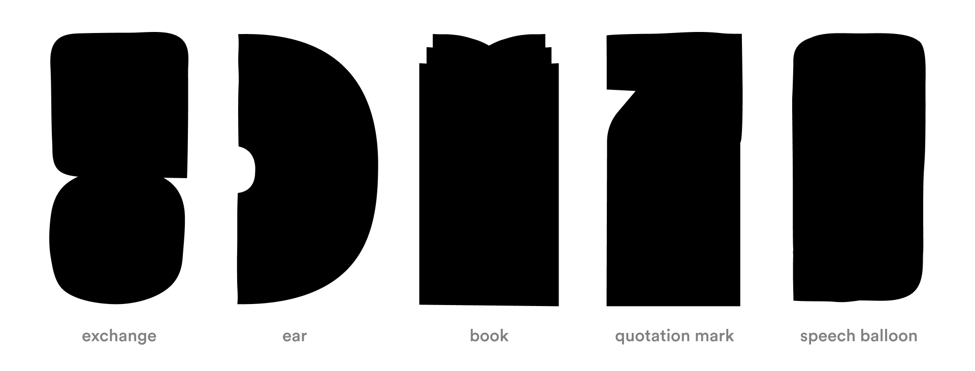
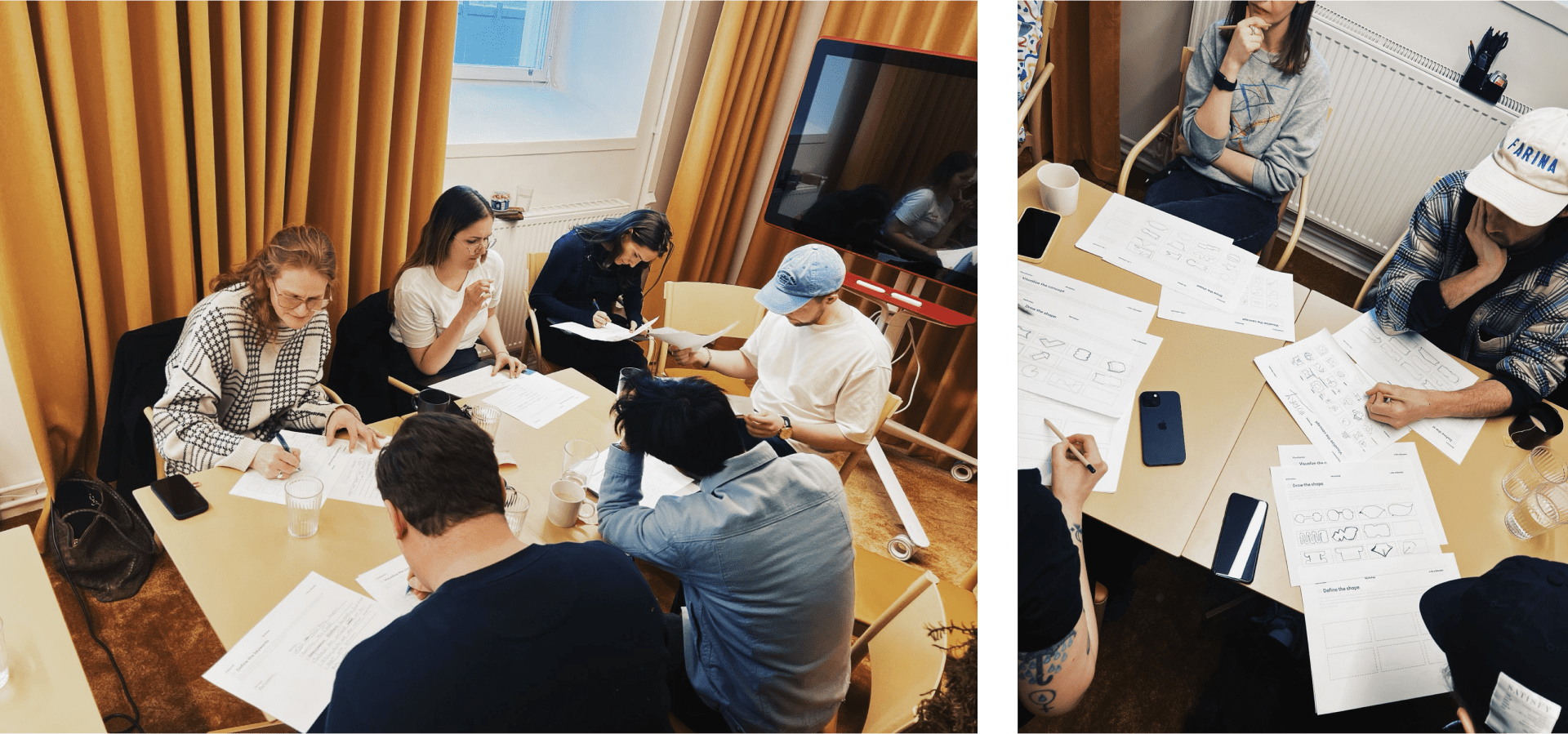

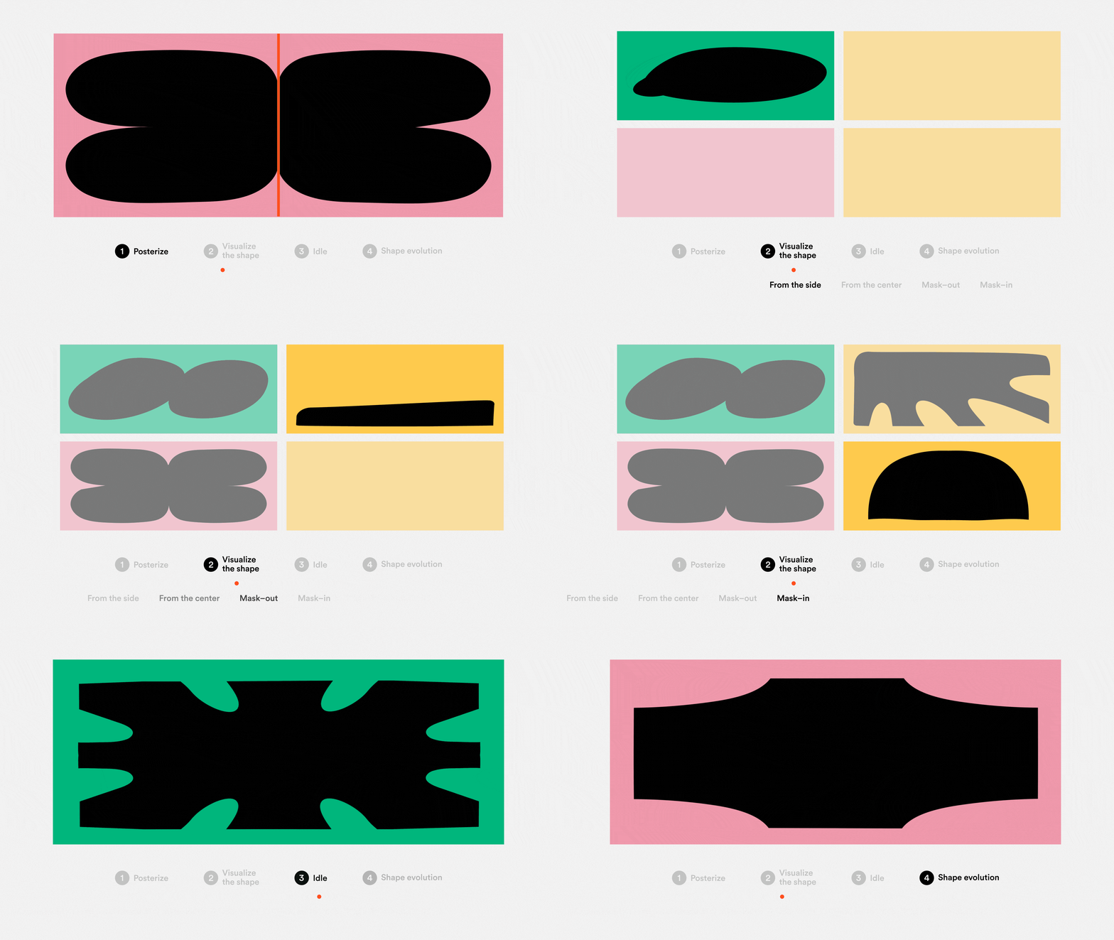
Our goal was not just to create a strong and recognizable visual identity, but also to build a flexible language that Storytel’s team and their partner agencies could reinterpret creatively—where designers and creatives can still have fun experimenting with it. To help the team become independent in creating new shapes, we organized a workshop at their HQ in Stockholm, breaking down the process into clear, manageable steps. The system is designed to be both inspiring and straightforward, avoiding unnecessary complexity. Each shape carries multiple meanings, offering an individual and accessible experience that can be tailored to various needs.


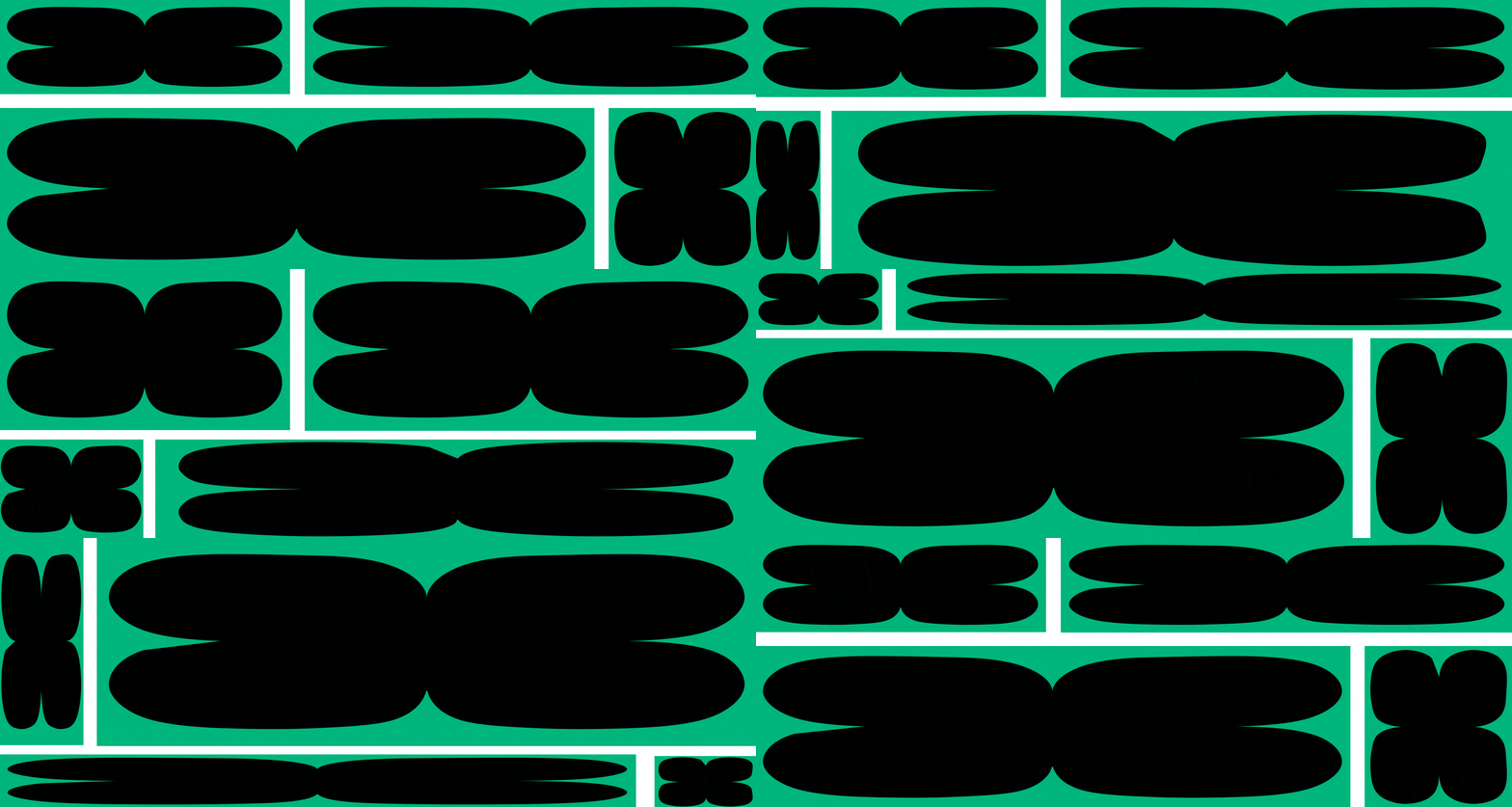
The motion system we created for Storytel was all about capturing the feeling of sitting "Around the Campfire," inspired by the flickering, organic movement of fire. We wanted it to feel warm, approachable, and human—just like the subtle vibrations of a sound wave. The goal was to design something that would emotionally connect with users naturally.

Although the monolithic shapes are the most visible elements of the visual identity, we applied the same expressiveness to other core elements—like the logo, transitions, and typography—but in a more subtle way. Through expressive shape morphing, the movements gradually resolve into the final form—whether it's the logo or a layout frame. The typography animations are designed to enhance storytelling, unfolding word by word like the flickering of a fire. This approach adds character even to simple text and graphic elements, ensuring the entire identity feels cohesive and vibrant.
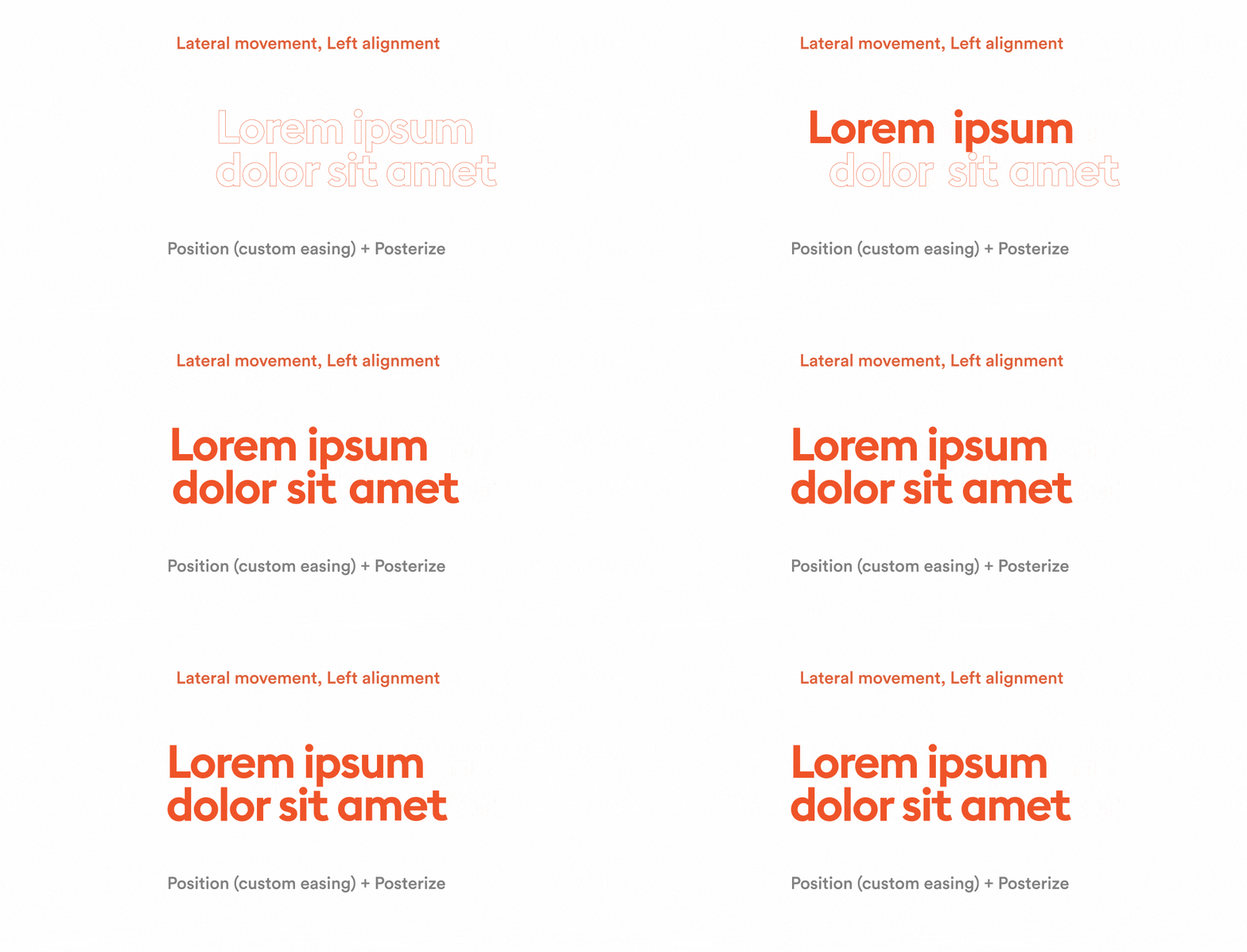
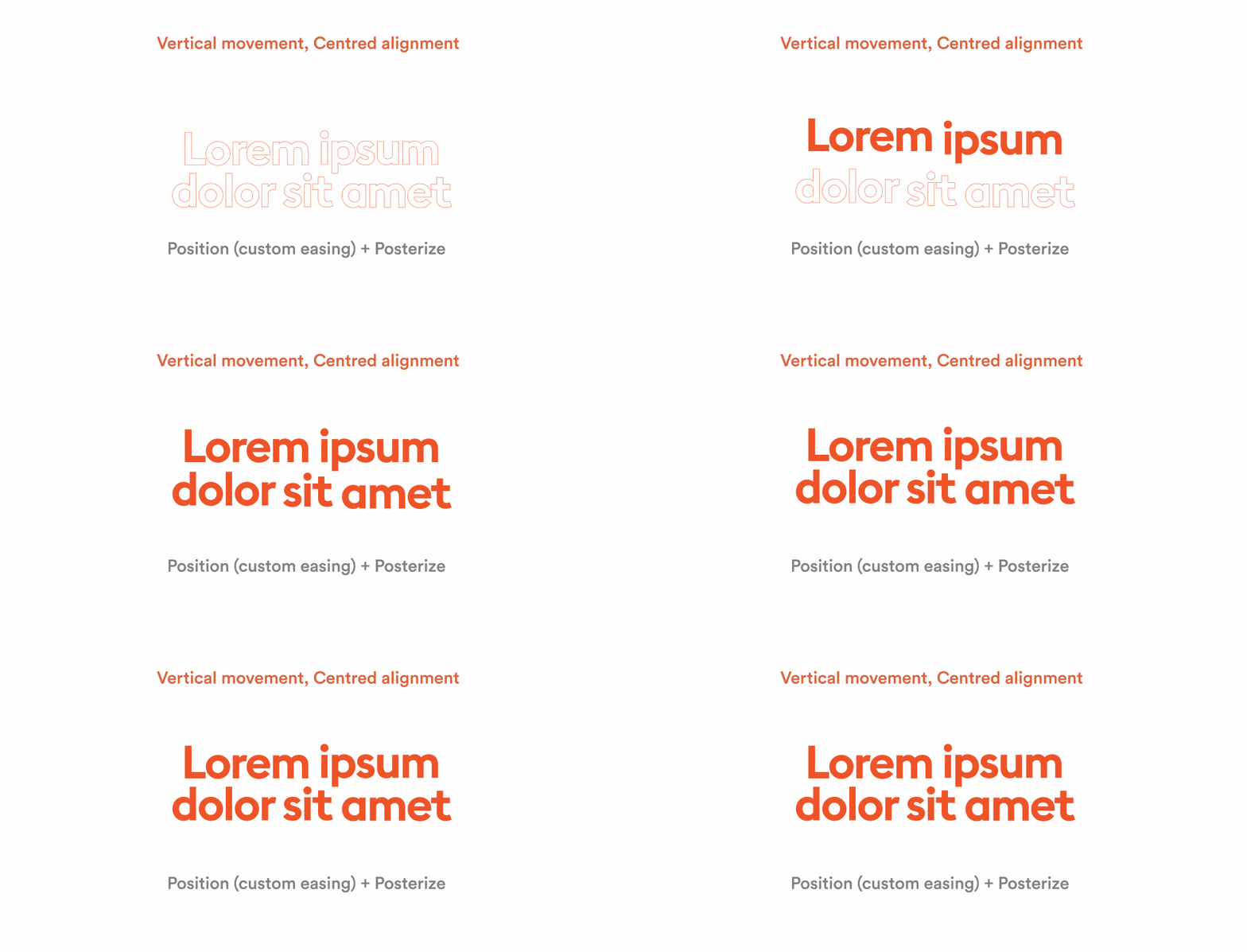

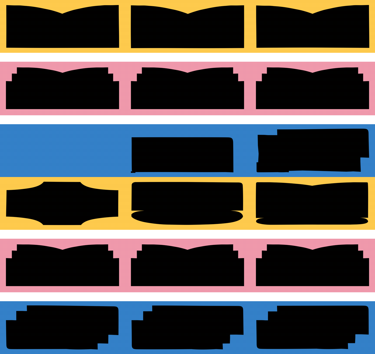
A big part of this motion system was keeping things abstract. Instead of being too literal, we let the animations remain open to interpretation, so viewers could connect with them in their own way. The motion style took cues from stop motion, with a flickering, imperfect vibe. Another key idea was shape morphing, which symbolizes how stories change and evolve over time. These transitions aren’t just about moving from one shape to the next—they feel like a story unfolding visually.
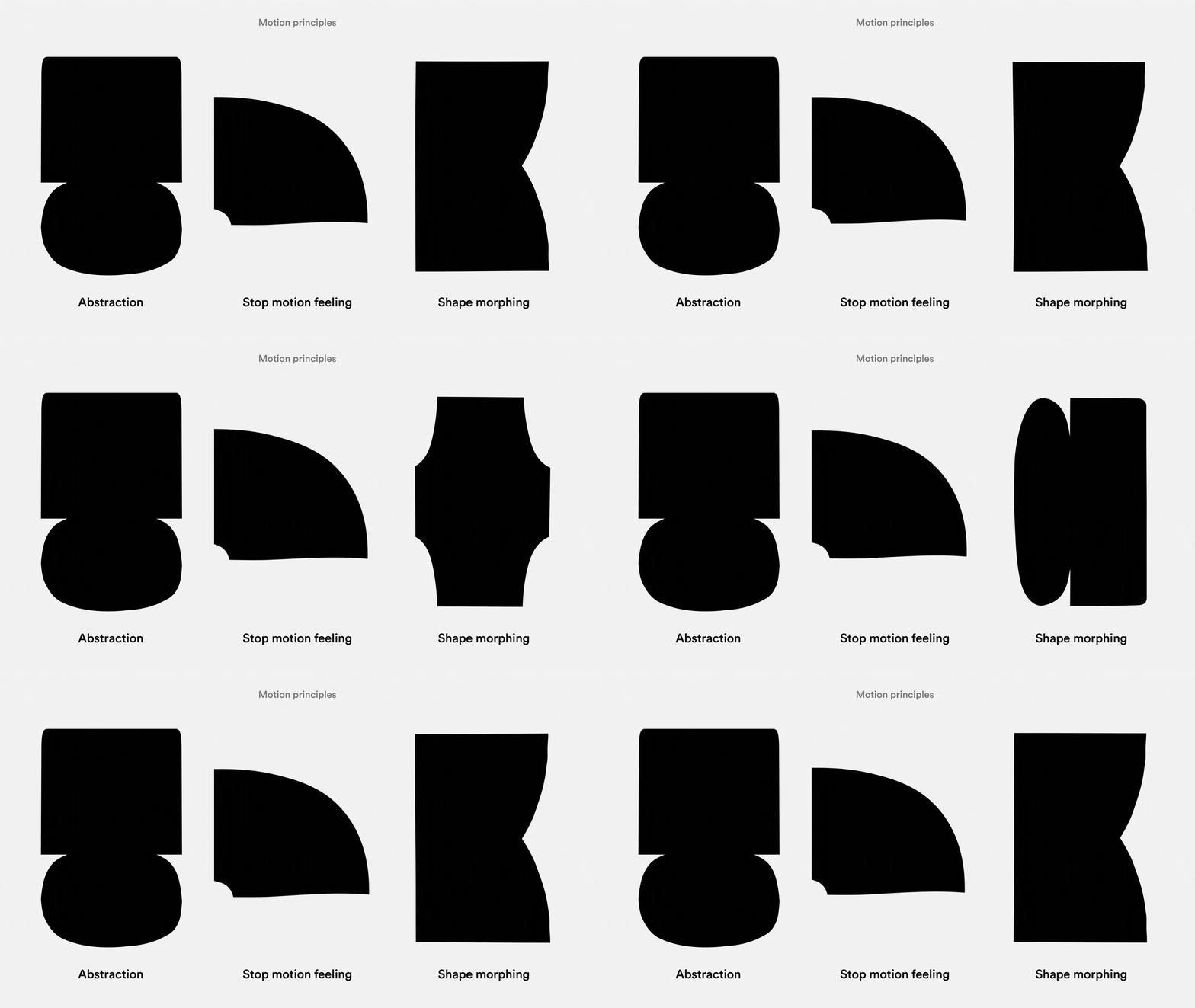

Shape-wise, we defined simple, understandable, and distinctive motion principles. We came up with the idea to maximize the scalability of the system by developing three states for each shape—reveal, loop, and evolution. This approach allows the shapes to be highly flexible and expressive, capable of functioning both independently and in combination. They can be stretched, cropped, or morphed while still delivering dynamic and engaging results that align with the overall visual identity.
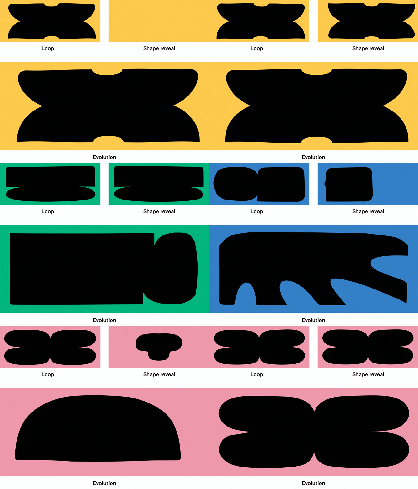
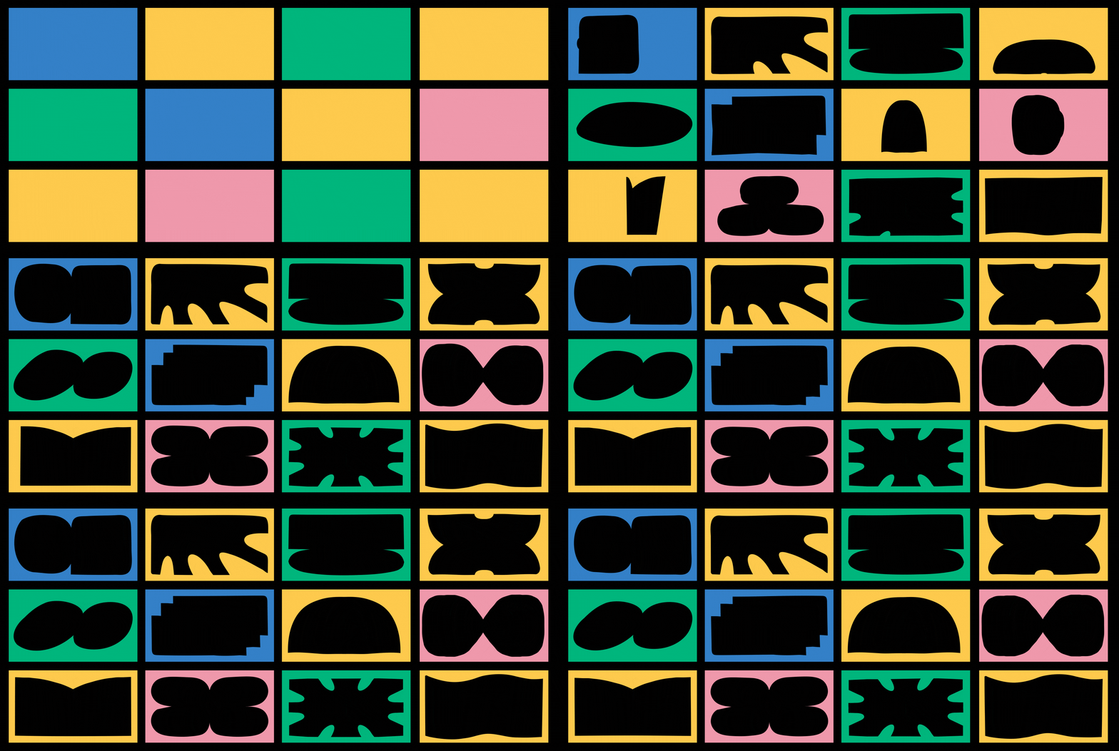
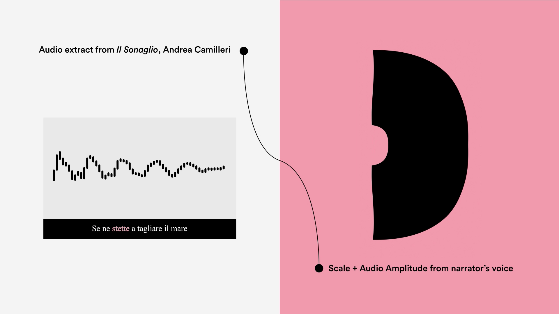
The motion system was rooted in an analog process. To inspire a sense of warmth and tangibility, we began by exploring physical shapes, intentionally hand-cut from paper imperfectly, creating a stop-motion effect. After several tests, we found the key to the visual language and translated these vibes and level of expressiveness into a fully digital process, making it more scalable for everyday use. Another experiment we conducted during the research phase for the motion direction involved connecting animation features to the input of a narrator’s voice. This allowed us to create human voice-driven effects, where the narrator’s voice directly animatesd the shapes, adding a unique layer of interaction and expressiveness.
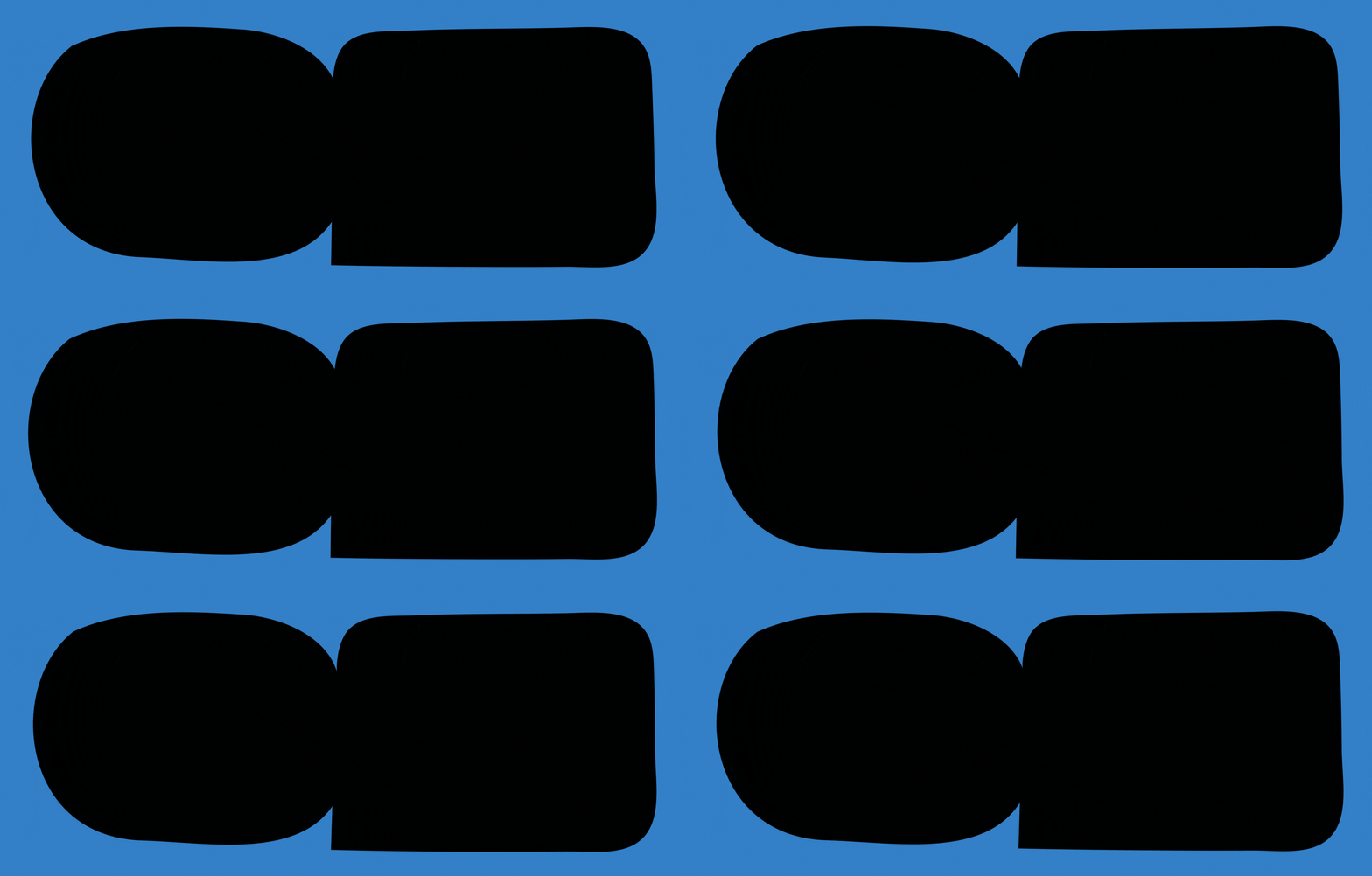
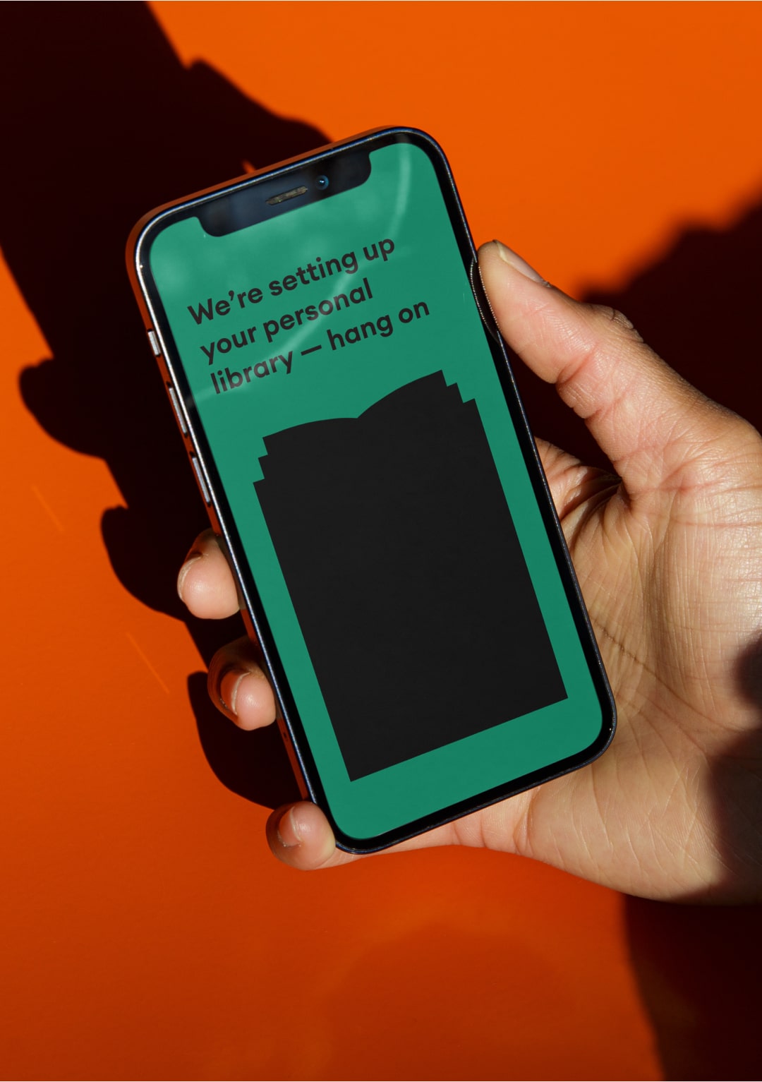
This visual language is truly ownable and distinctive, designed to work seamlessly across a wide variety of applications. Whether it's in-product elements, marketing campaigns, or internal communications, the system adapts effortlessly while maintaining its unique identity. What makes it even more special is how it was developed in close collaboration with the Storytel team. Together, we created a flexible and scalable system that not only reflects the brand's personality but also empowers Storytel to take ownership of their visual identity, ensuring long-term consistency and creative freedom.

Credits — Creative Direction Ilenia Notarangelo + Art Direction Arianna Cristiano + Motion Lead Valerio Di Mario + Illustration Andrea Vago + Motion Design Valerio Di Mario, Dave Cubitt, Miguel D’Errico, Matteo Ruffinengo, Riccardo Chiara + Producer Daniel Ceballos + Portfolio Case Study Giovanna Crise — and for the Storytel team: Head of Design Lena Hammes + Brand Design Lead Minda Jalling + Product Design Lead Coraline Janvier + Creative Lead Jay Quirke + Performance Marketing Designer Nina Doljak
