Cheddar Up Branding
From logo animation to character illustration, we used bold shapes and vibrant colors to design the website for Cheddar Up.
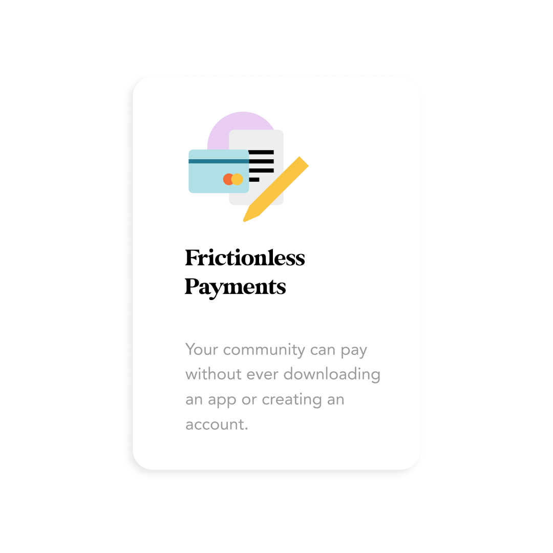
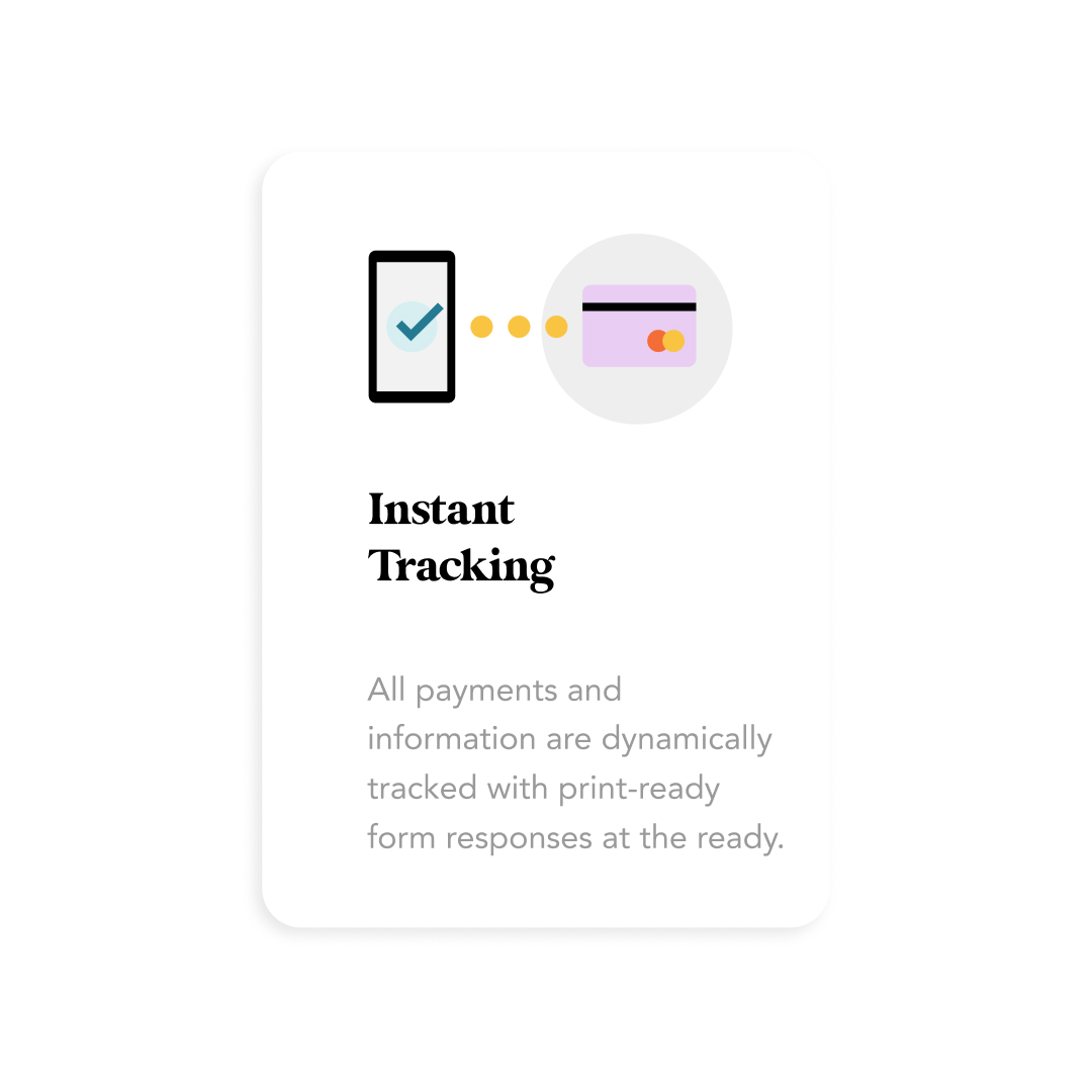
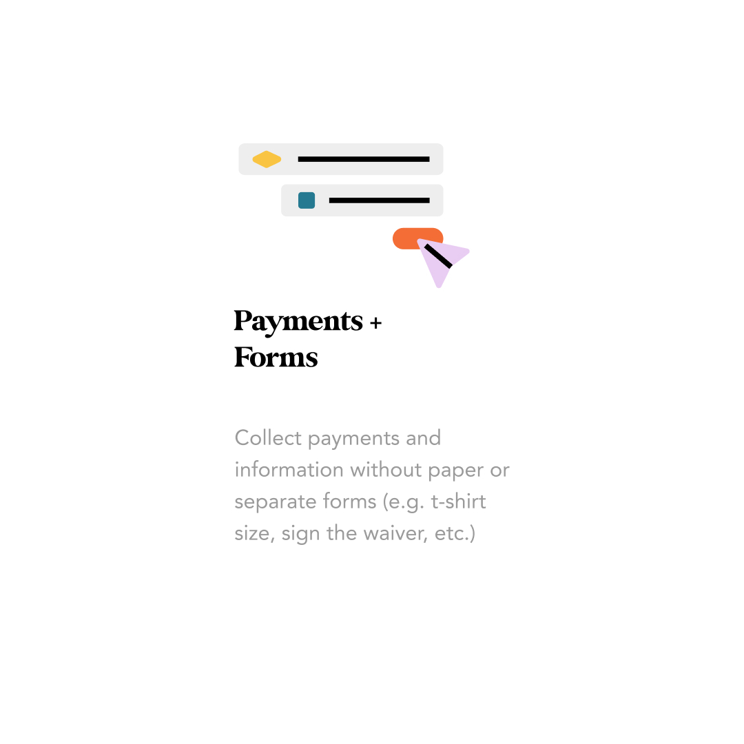
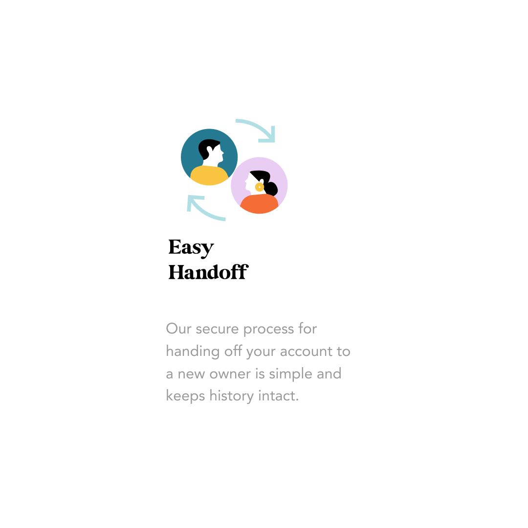
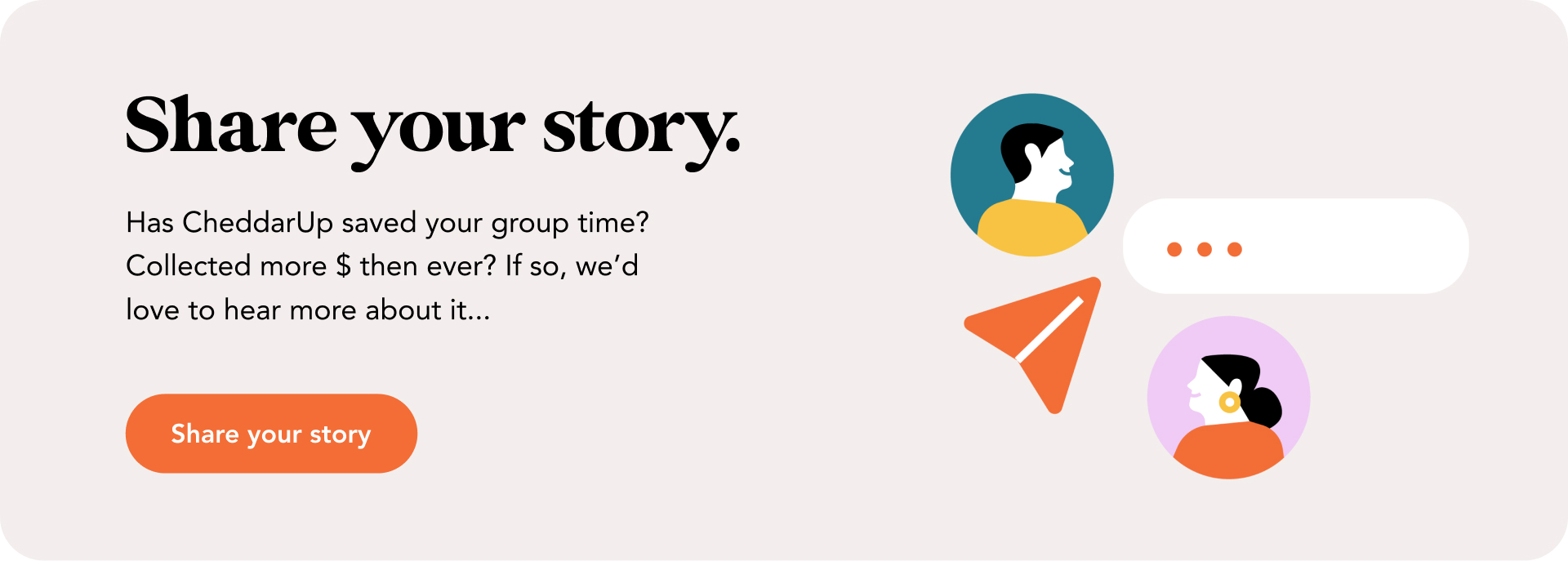
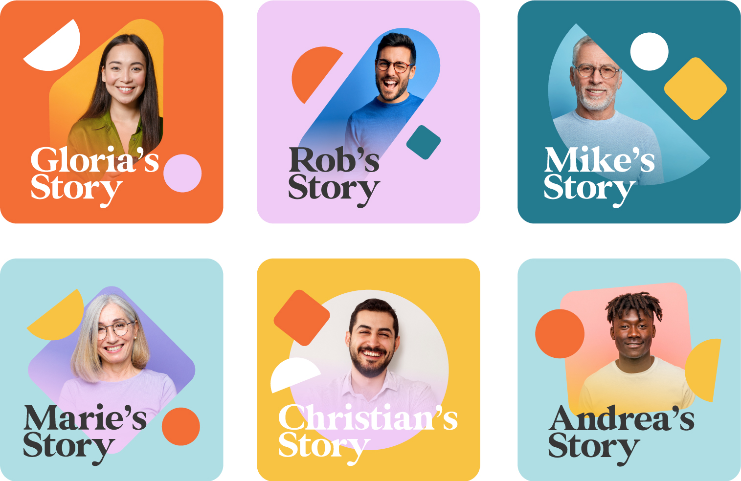
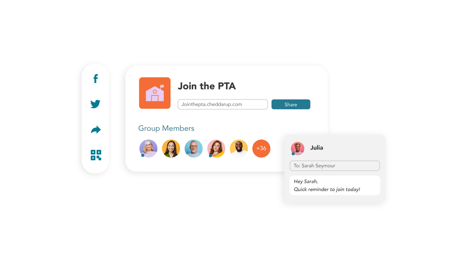
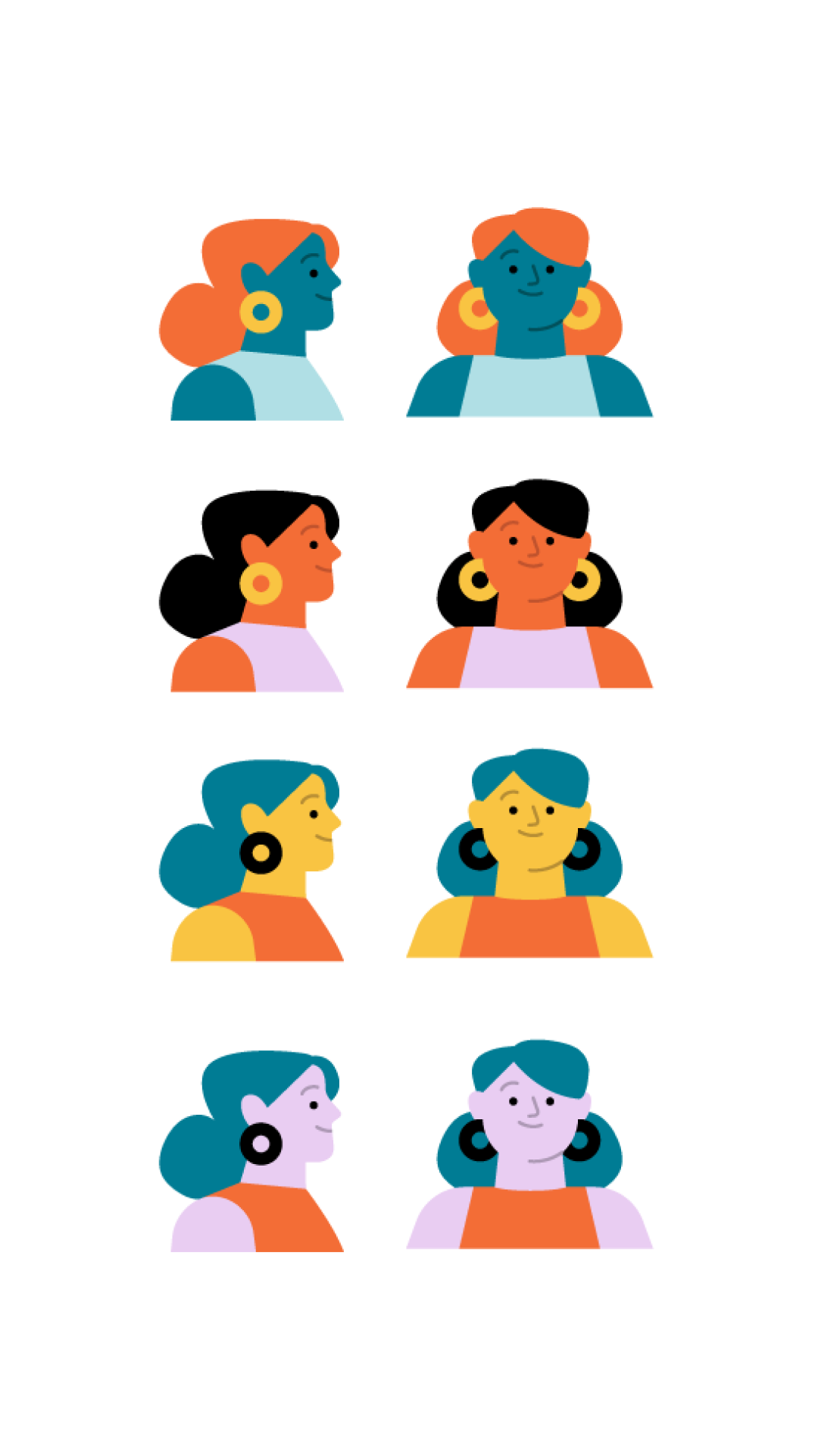
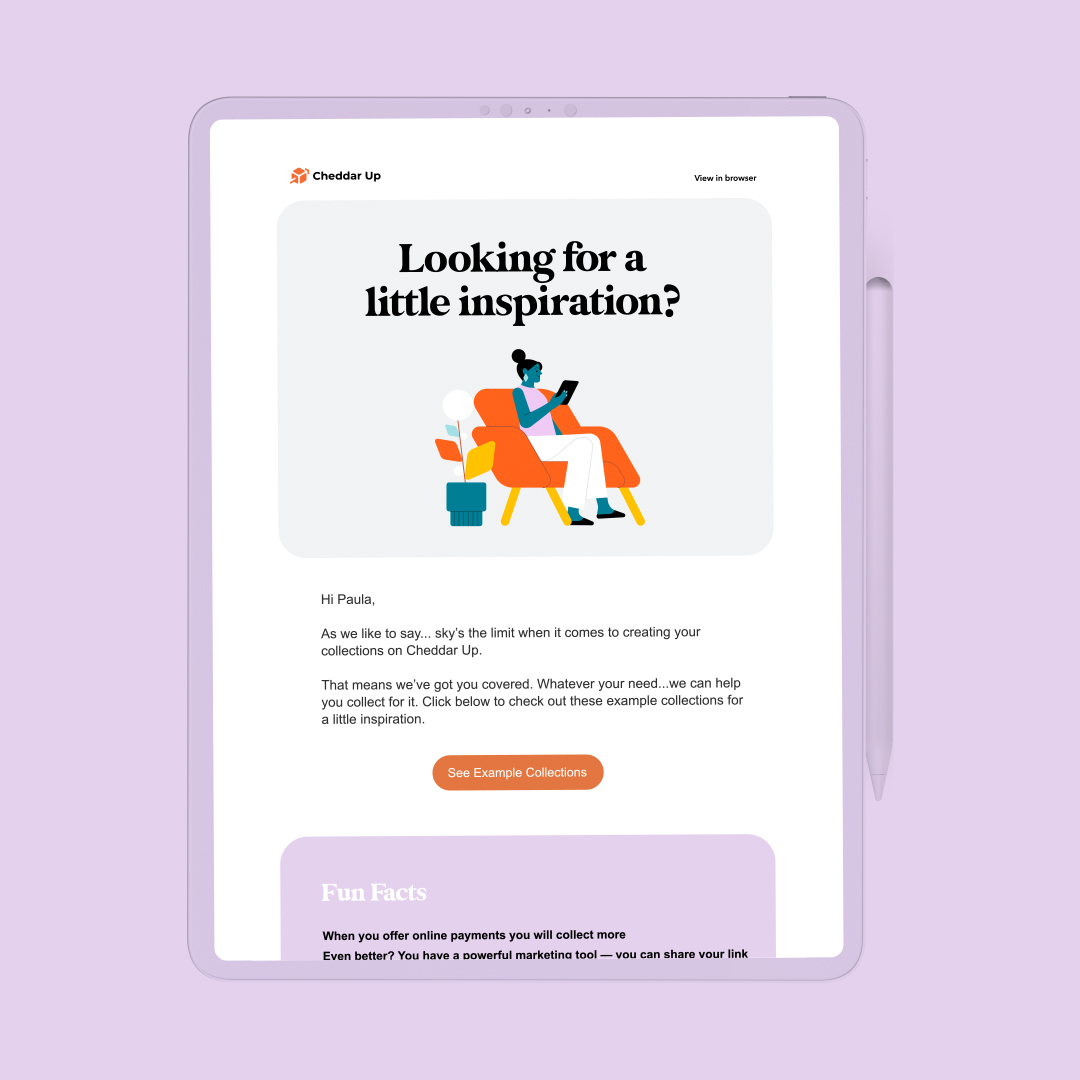
Cheddar Up is the playful tech platform that makes it easy for group organizers to collect payments and forms online—we, in turn, made it easy for them to communicate this in a catchy, fun way. We designed their website UI, created some visual assets to help it stand out and added some of our animation magic to the mix. We also developed some brand updates in the process, from the color palette to the use of soft shapes as a distinctive sign. Geometric masks revealing their user avatars and smooth, minimalistic UI design helped create a playful, clean aesthetic to better communicate the brand’s personality. Adding an even more personal touch, we illustrated and animated characters to accompany Cheddar Up’s newsletters and establish a more genuine, relatable connection with their users. Finally, we had plenty of fun animating their logo and deconstructing the shapes for a cohesive look across the website.
Logo animation
Branding application
Website
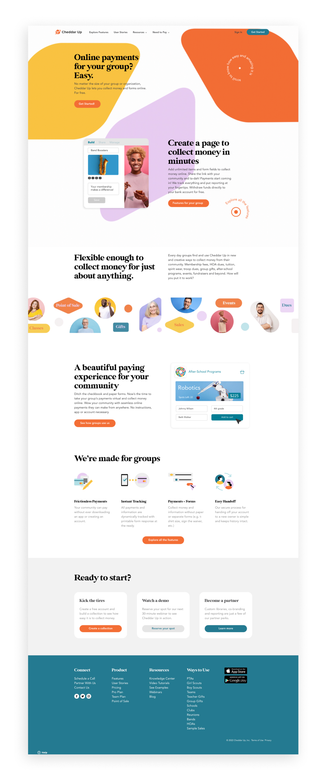
Homepage
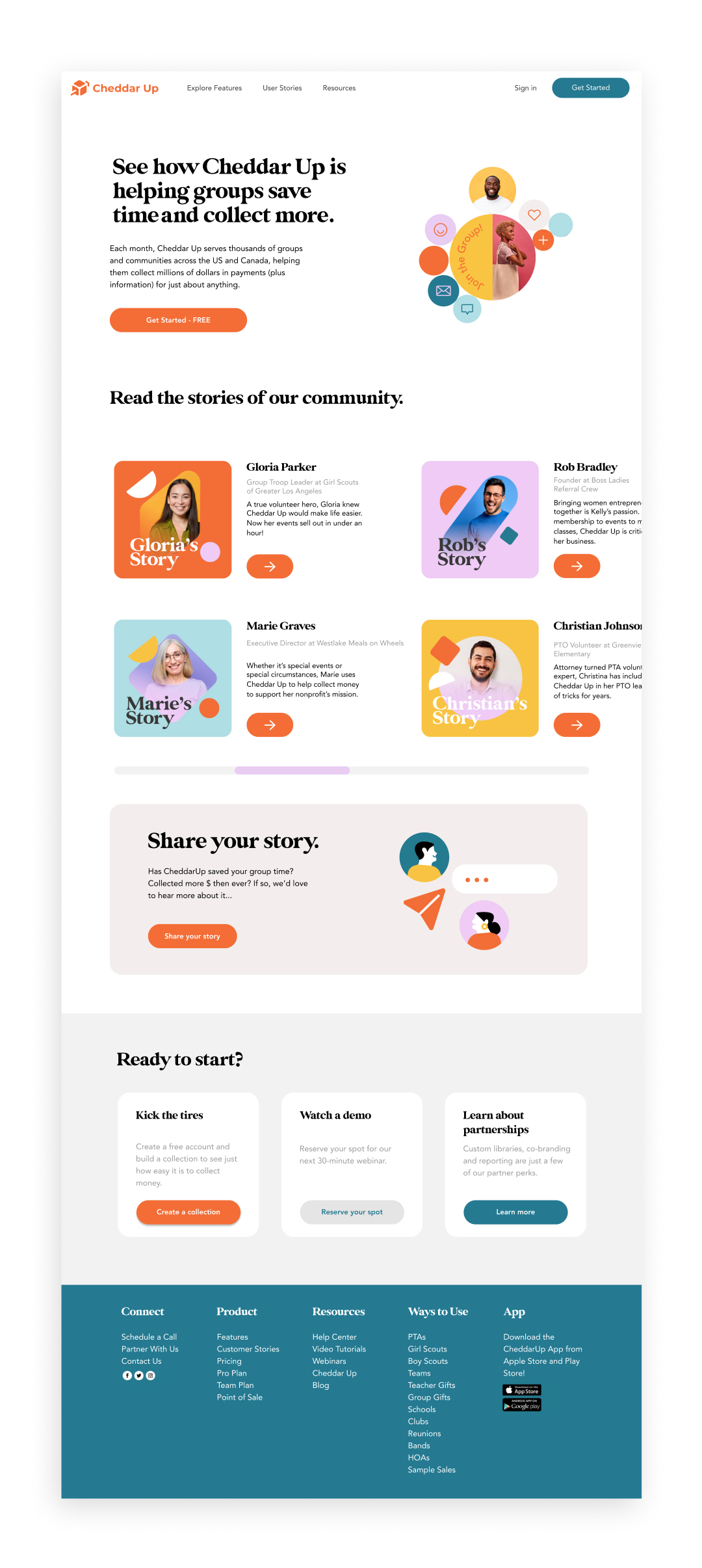
User stories
Character design for Welcome mail
Credits — Creative Direction Cristina Pasquale + Producer Ani Karamanukyan + Design Cristina Pasquale & Arianna Cristiano + Animation Lead David Cubitt + Illustration Sofia Buti + Animation Fabio Orlando & Miguel D'Errico + Portfolio Giovanna Crise
