
At your door Motion 2D + 3D
A studio exploration mixing 2D & 3D in a very unique illustration, motion language and interactive skeuomorphic icons for a project in the food delivery industry.
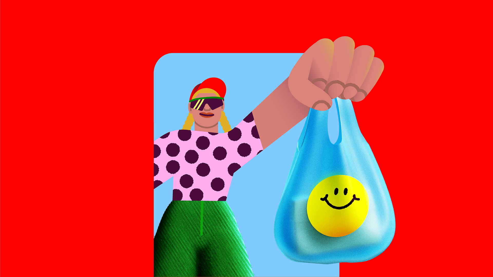
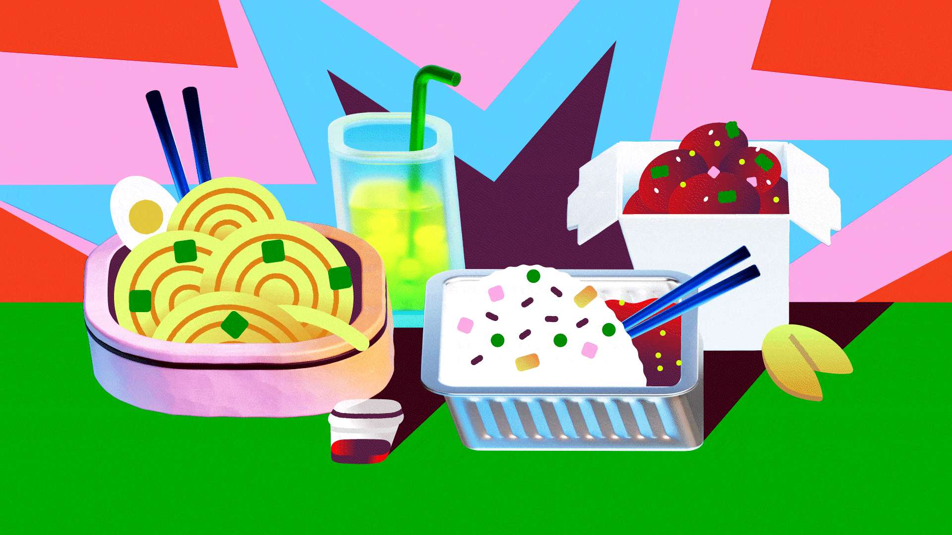
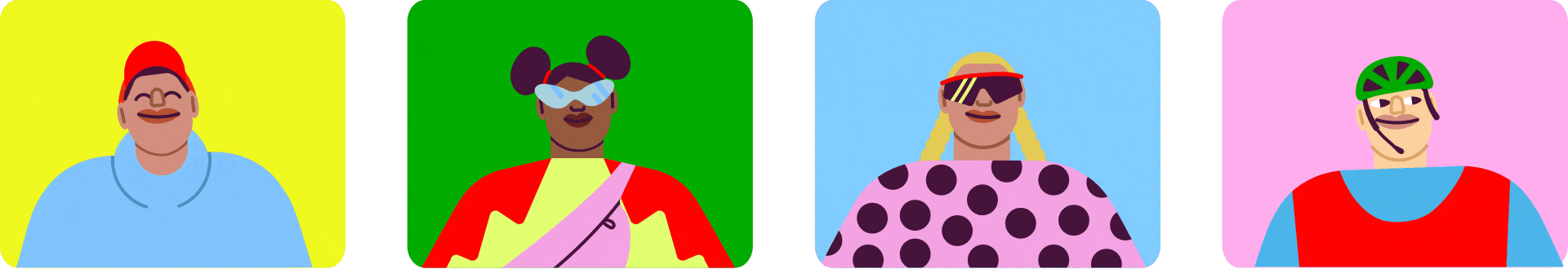
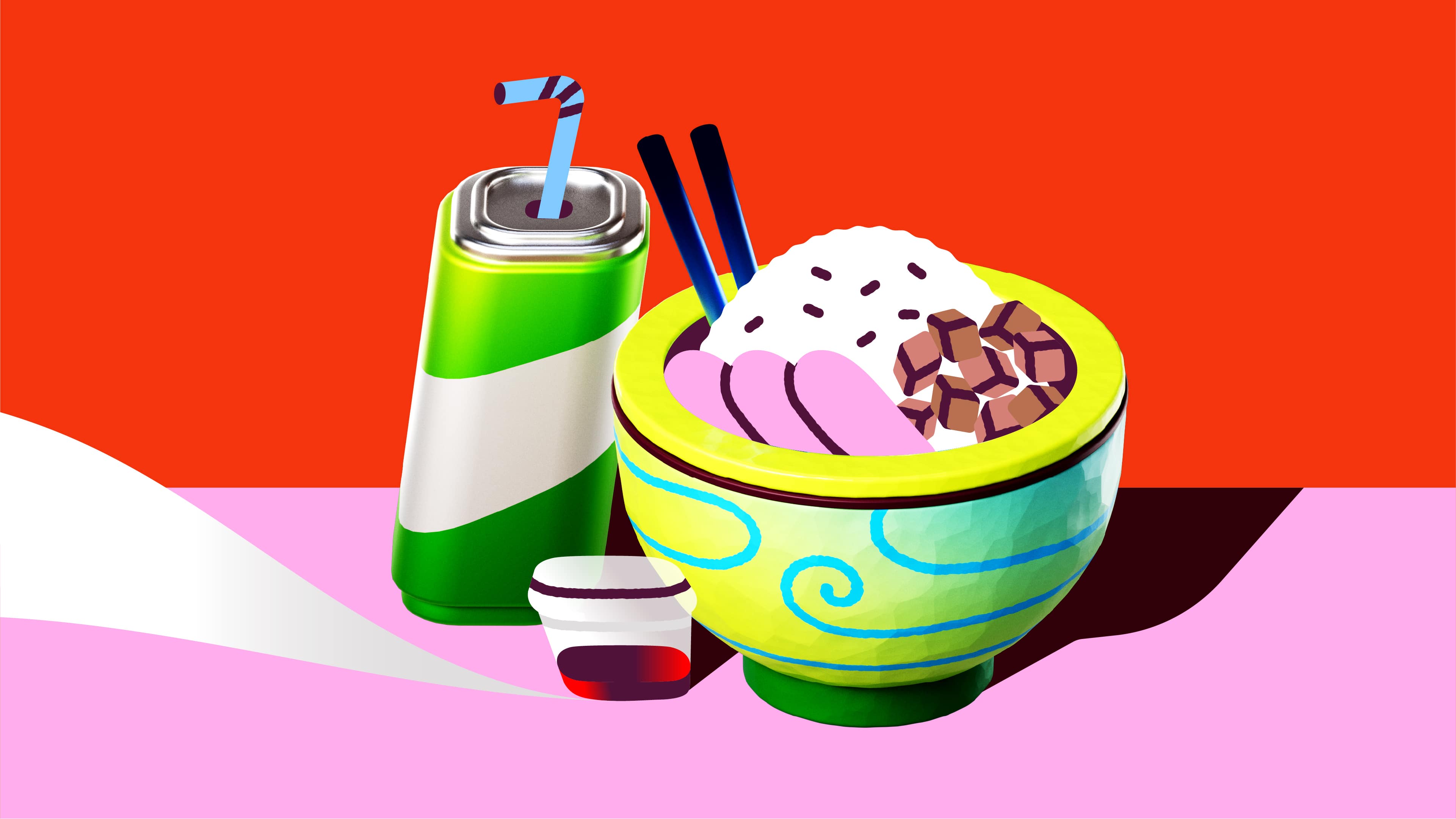
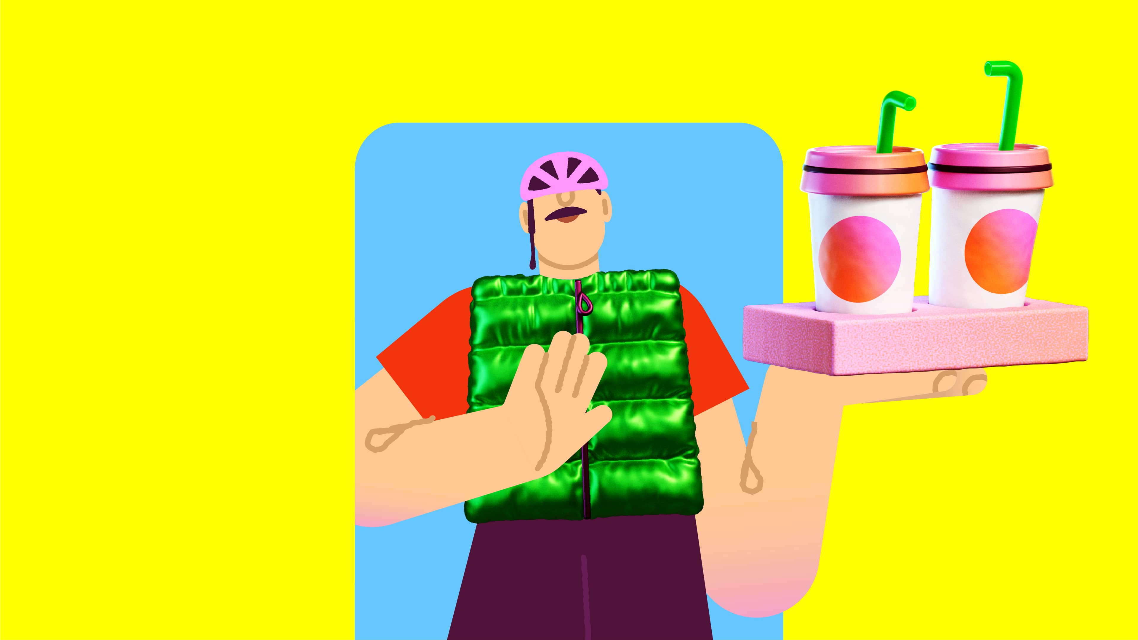
The core creative idea was to work with an extended team and create a sort of stylistically cadavre esquis. Layer after layer each team member was adding a bit of their perspective, but also trying to keep a consistent overall direction that could make sense and could be fun to explore. A bold mix of flat vectors and soft-touch 3D, with added textures that break the perfection of digital. Saturated colors, stylized forms, expressive characters and theatrical poses — the visual language feels fresh, pop, and deliberately unpolished. Imagine character designers, graphic designers, and 3D artists sitting at the same table, telling a story about food and movement. By adding texture and imperfections, we pushed against the polished feel of 3D — aiming for something more expressive, crafted, and alive. A colorful story that captures the simple act of a delivery service, and the creative energy of a great team work! But we didn’t stop there. As part of this exploration, we realised that some of the assets we created had a very cute “icon” look if extrapolated from the context. So we got our R&D team involved to experiment with skeuomorphic icons using Spline. We had two main goals: testing new tools and evaluating solutions that could potentially be integrated into real digital products (both websites and apps). You can check out the full set here or test the ones down below!
Check it on — Motion Design Award Video of the day + Behance Motion badge


Credits — Credits — Creative Direction Ilenia Notarangelo & Cristina Pasquale + Design Direction Arianna Cristiano + Illustration Arianna Cristiano, Sofia Buti, Michele Giamello & Andrea Vago + 3D Illustration Michele Giamello + 3D Animation Riccardo Chiara + Animation Riccardo Chiara & Fabio Orlando + Interactive 3D icons Matteo Ruffinengo & Michele Giamello + Sound Design Fabrizio Martini + Case Study Giovanna Crise & Laura Mazzarino