Essilor Luxottica Motion
We teamed up with EssilorLuxottica to create a motion series for Essilor that makes complex vision topics a pleasure for the eyes.
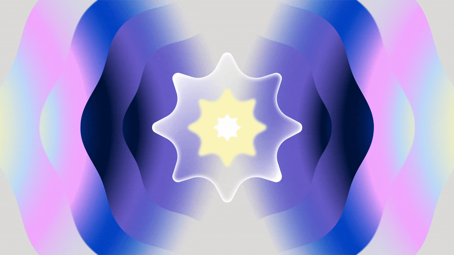
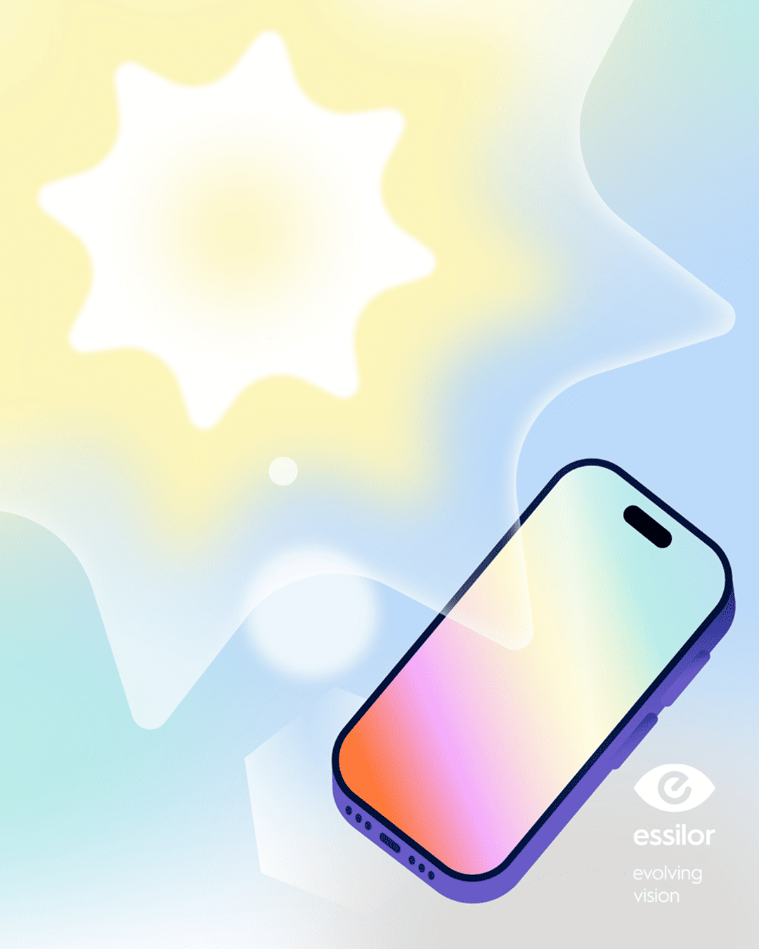
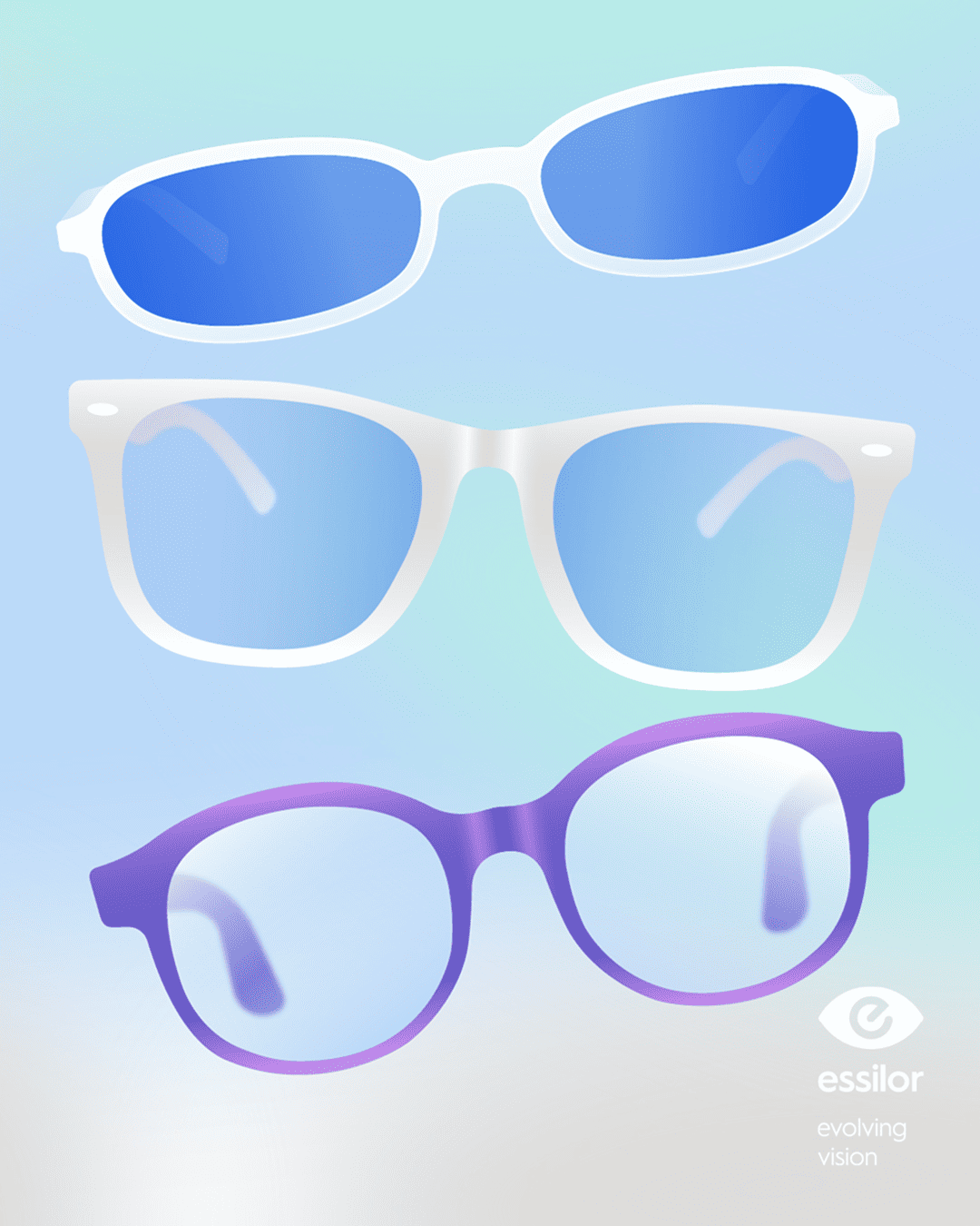
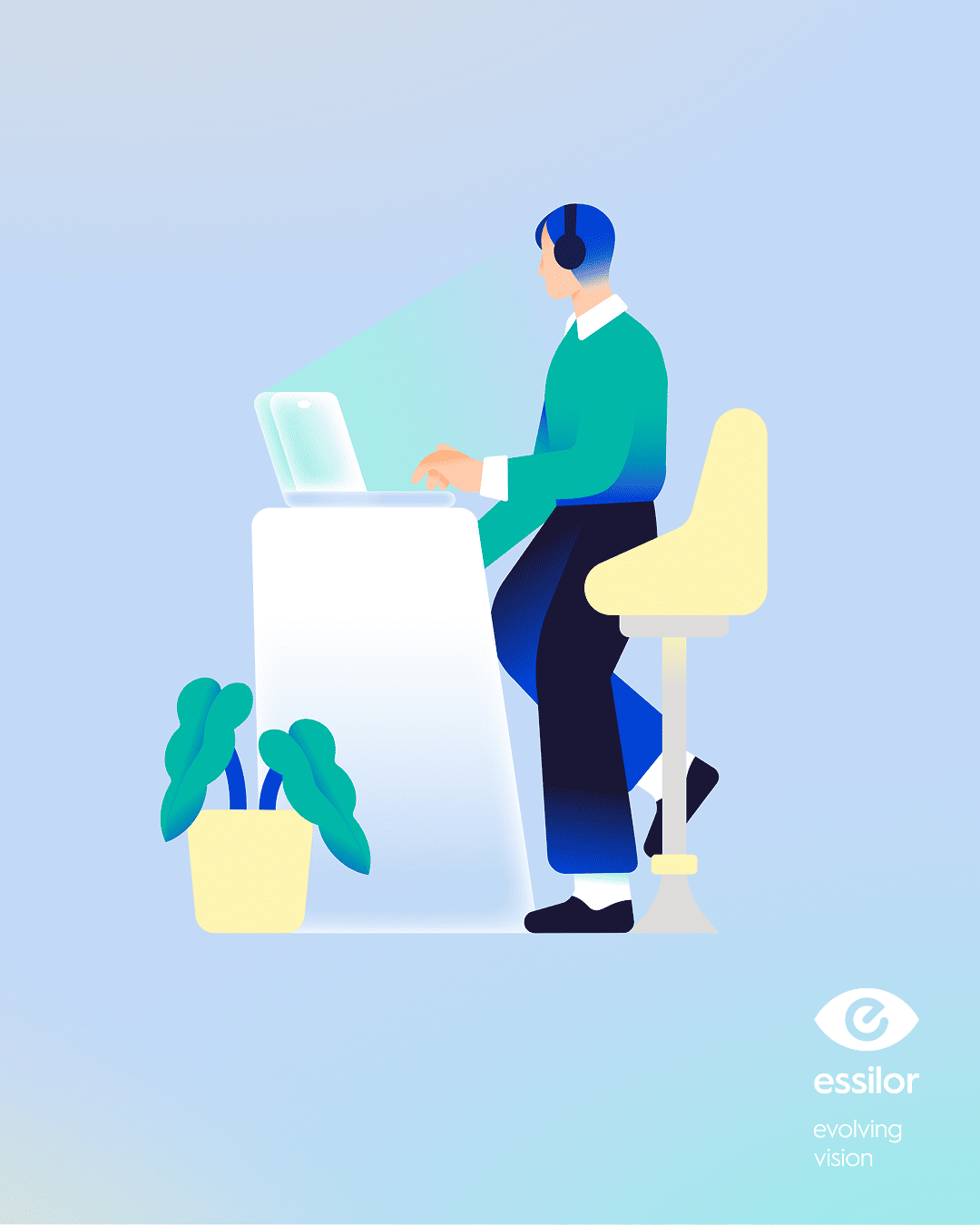
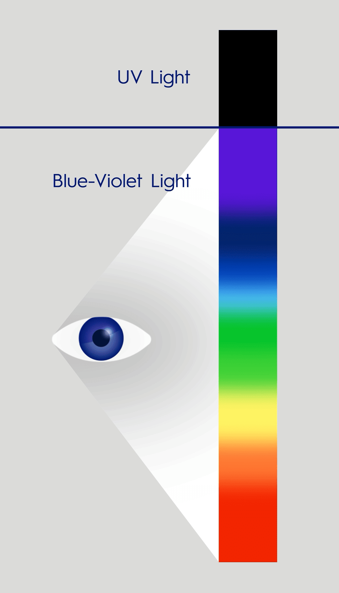
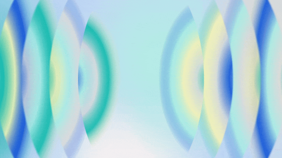
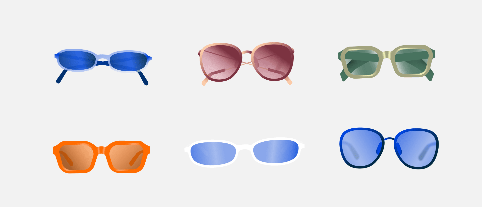
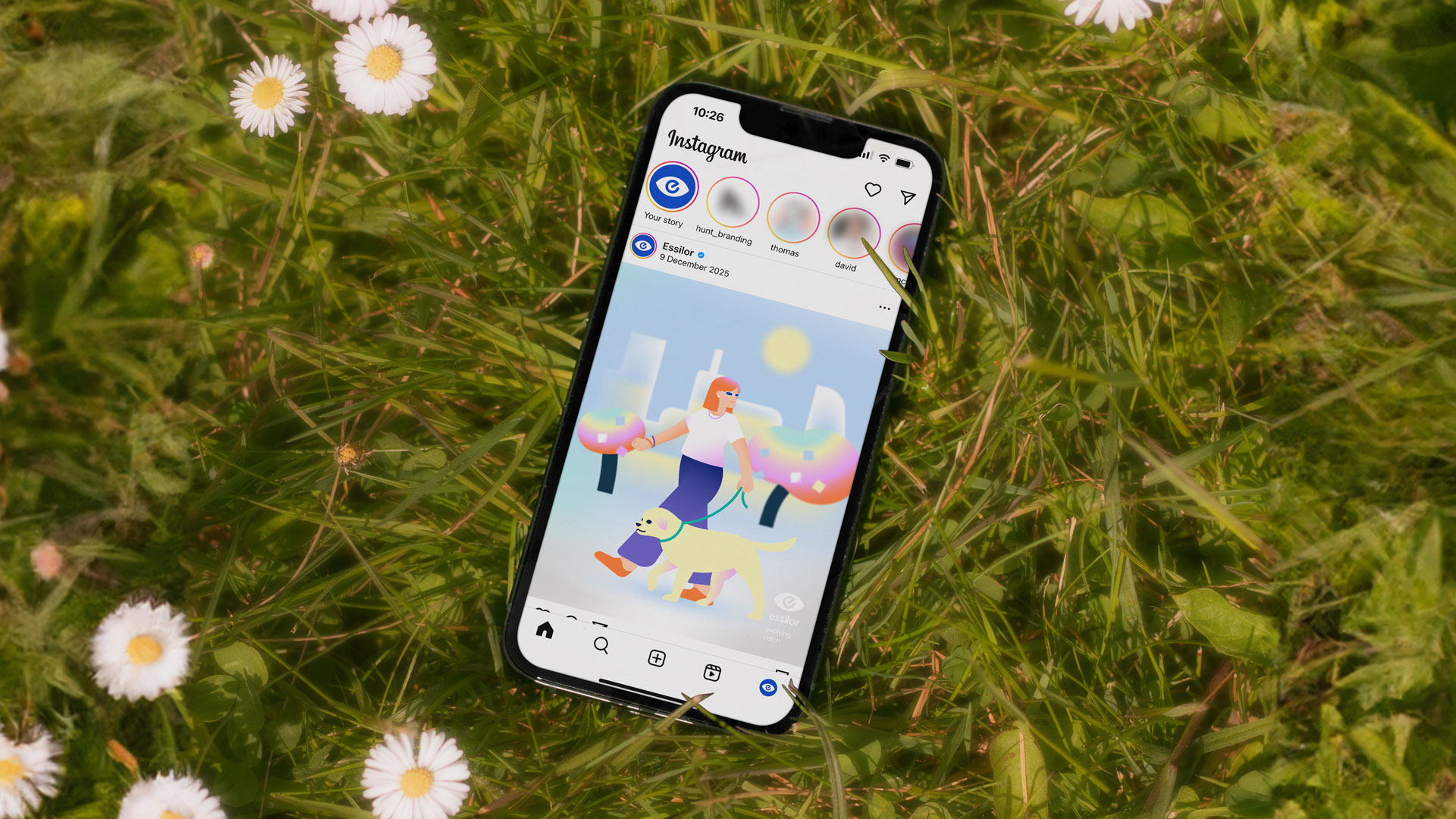
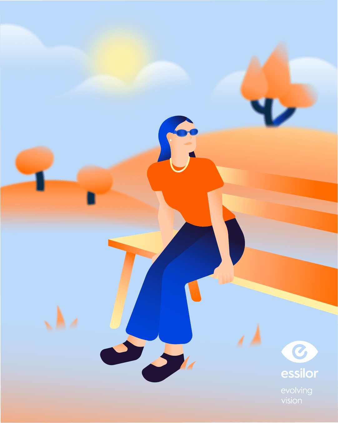
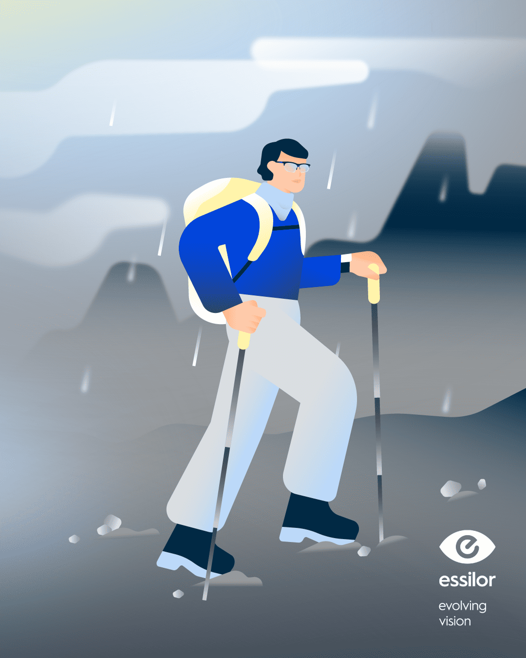
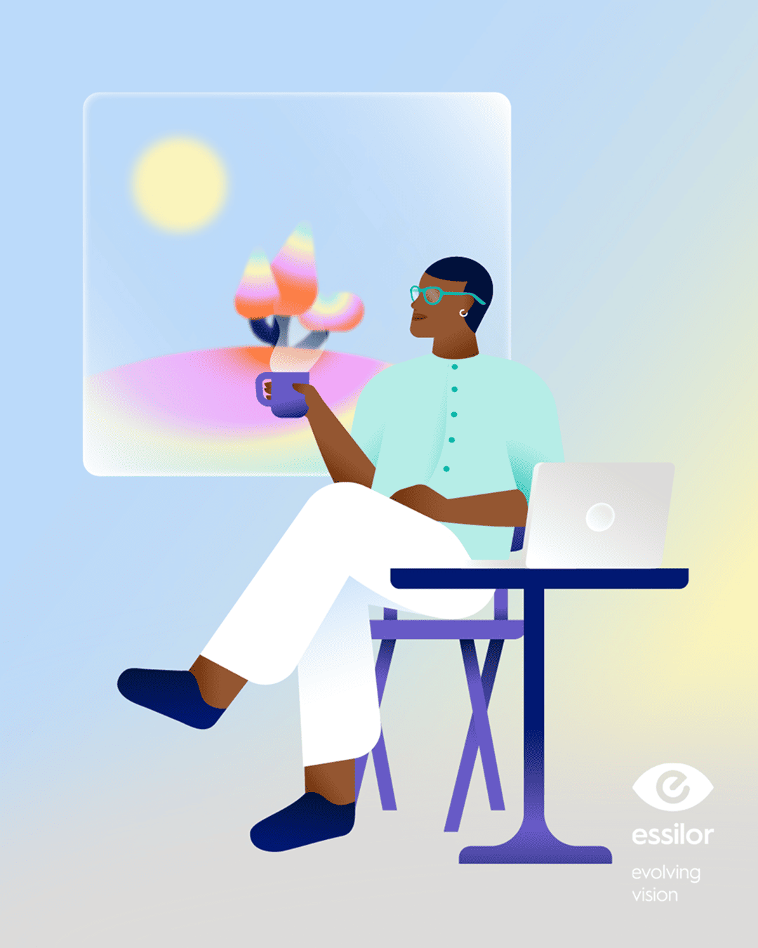
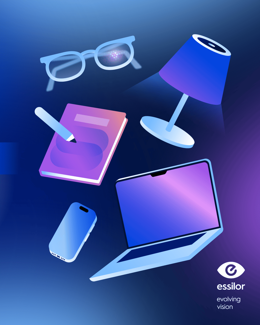
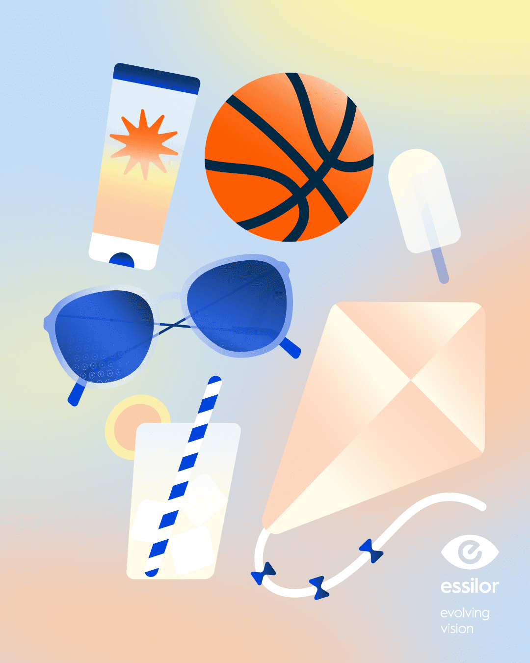
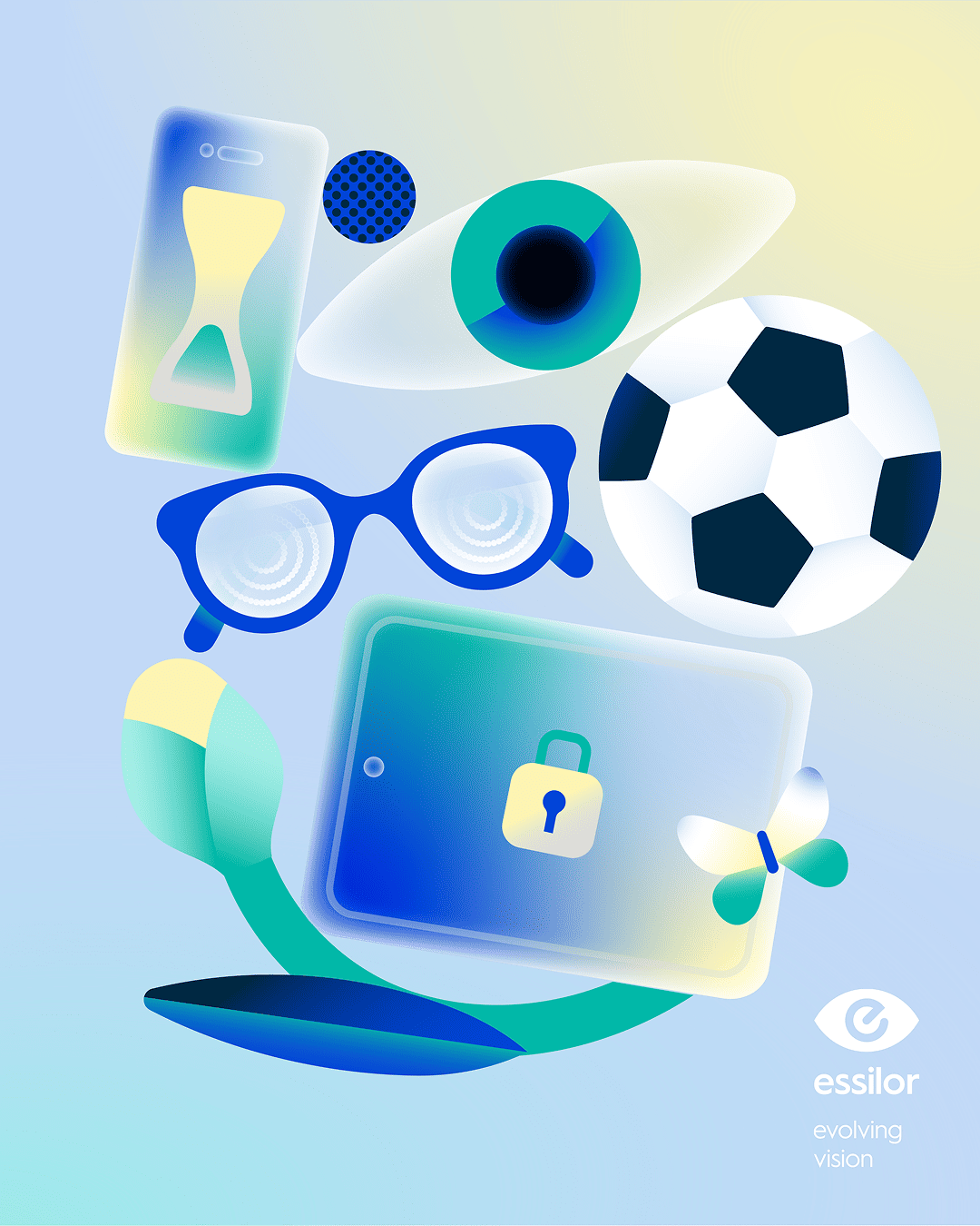
The project came from a simple question: how do you explain things like myopia, blue-violet light, or visual fatigue in a way people don’t skip, and actually engage with? We worked across five very short videos and ten carousels, all designed to feel clear, visual, and easy to follow. The biggest challenge was time. Each video had roughly ten seconds to say something meaningful and genuinely useful. That forced us to strip every topic down to its core, find strong visual shortcuts, and let motion do part of the explaining instead of relying only on text or voiceover. We started from Essilor’s clean, high-tech identity and twisted it slightly. We mixed 2D and 3D and played with soft gradients and blur. We used blur as a subtle reference to focusing, seeing clearly, and how vision actually works. On top of that, each topic has its own colour and pattern, so every video feels distinct while still belonging to the same system. Essilor blue, grey, and white hold everything together, with a specific accent colour guiding each theme. What we really enjoyed was working with concepts that are abstract, scientific and sometimes very tangible, like the product or the technology itself, and turning them into something people can immediately grasp. The series moves between figurative visuals, science-driven moments, and more expressive motion, showing how flexible the design language can be without losing consistency. The result is a compact motion series with five different rhythms and identities, all speaking the same visual language. Informative without feeling heavy, precise without feeling cold, and, most importantly, easy to watch.
Check it on — Behance Motion Badge
Credits — Creative Direction Cristina Pasquale + Design Director Arianna Cristiano + Illustrator Lead Sofia Buti + Illustration Alessandra Marin & Michele Giamello + Motion Design Riccardo Chiara & Marco De Vecchi + Producer Laura Mazzarino + Portfolio Case Study Giovanna Crise