Secret Client Motion system
We crafted a motion language for a global technology leader with grid-based shapes, outlines and animation rules to convey the complexity of their services in a unified visual language.
Check it on — Behance project + Instagram Post n° 890 + Stash Media Illo Reveals Their Motion System for a Secret Client + Mindsparkle Tech Motion Toolkit + Motion Design Awards Video of the Day


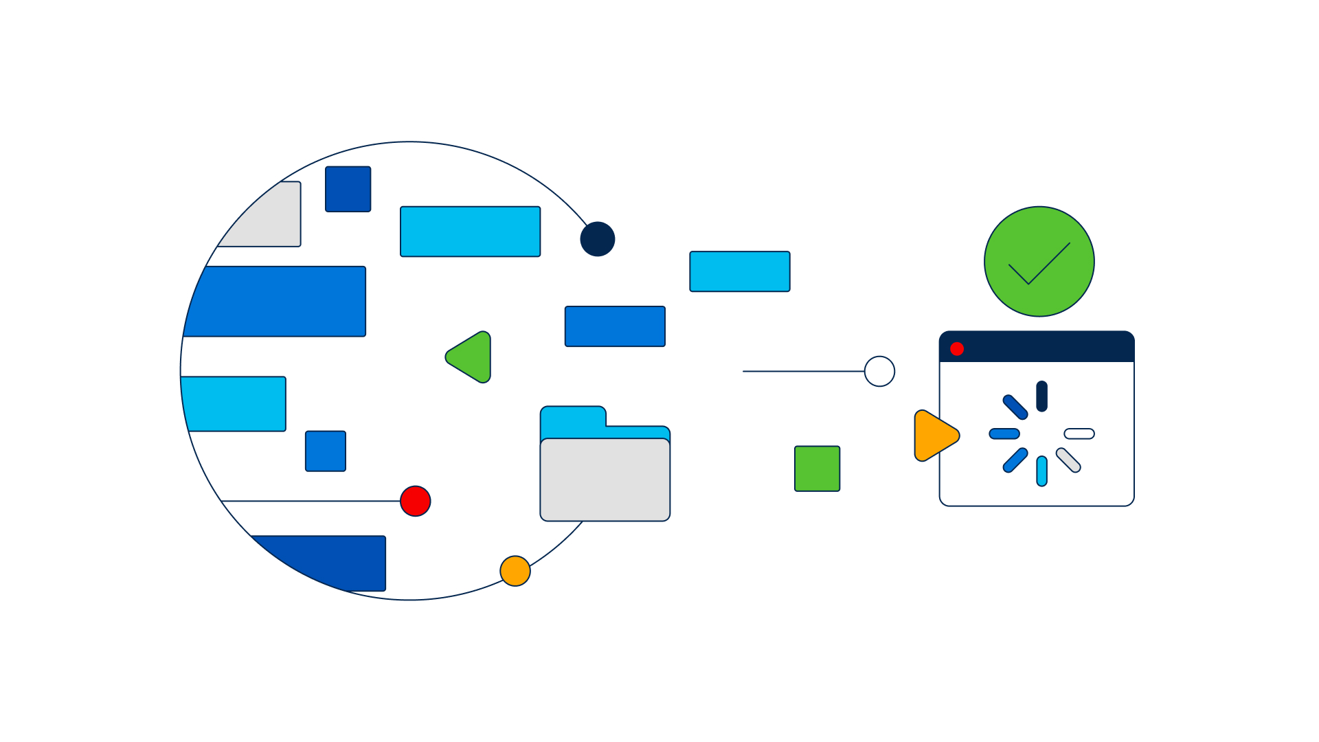
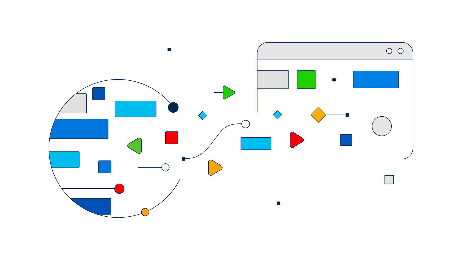
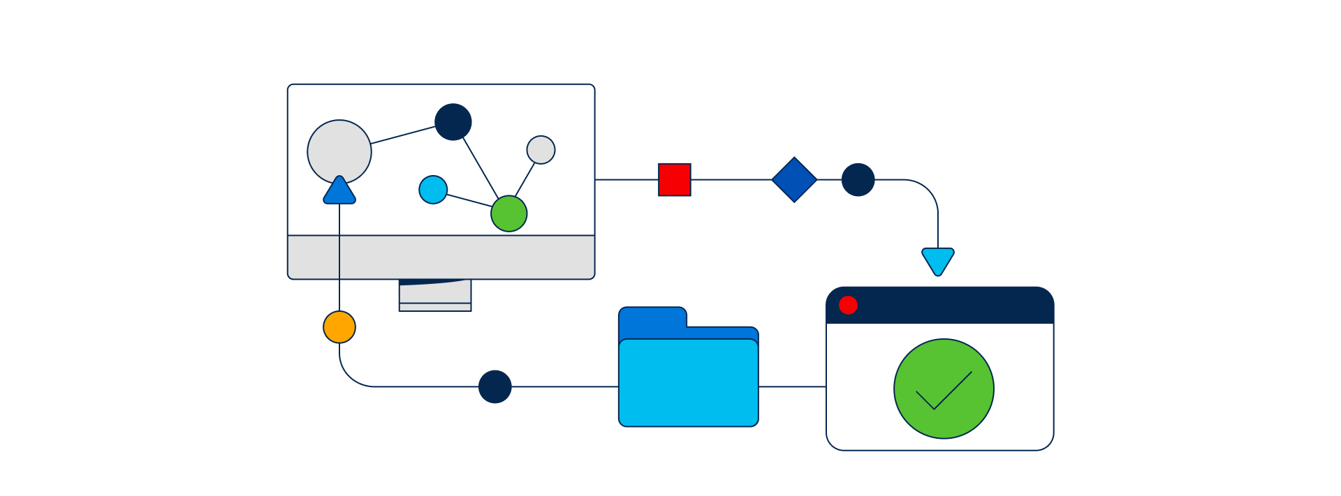
The outcome was a flexible system of moving shapes that could be used for a variety of purposes, from a hero image to a series of visuals for informative presentations. Our main challenge was to keep the system flexible and modular at the same time, in order to provide the client with a series of visuals able to convey the complexity of their services without being overwhelming. In order to achieve this goal, we developed a system of grid-based shapes and outlines, which could be combined in a variety of ways to create different visuals.


We also created a set of design and animation rules and guidelines that could be used to ensure a consistent look across different visuals. These rules included the use of a limited colour palette, the use of shapes to represent data by animating them in an interchangeable way, and the use of outlines to create visual interest. By keeping a consistent look and feel across different visuals, we were able to create a unified visual language for the tech client that can effectively convey the complexity of their services.

Credits — Creative Direction Cristina Pasquale + Illustration Cristina Pasquale, Sofia Buti, Alessandra Marin & Valeria Cunto + Animation Riccardo Chiara, Fabio Orlando & Miguel D’Errico + Producer Ani Karamanukyan + Sound Design Fabrizio Martini + Portfolio Case Study Giovanna Crise